

©2024-2026
CUBC Merchant*

Timeline
8 months
2024 - 2025
Team
Co work with Lead Designer, PMs, iOS & Android RDs, QA Team
My Role
Product Design
Product/UIUX Design
About
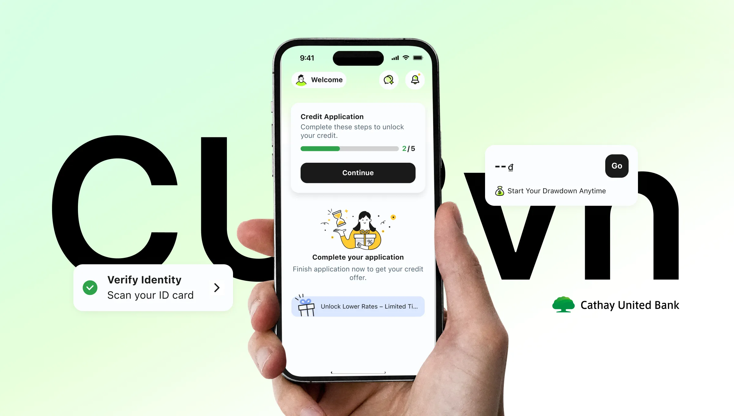
In Cambodia, small merchants are still running their shops with notebooks and calculators. So we built CUBC Merchant — a 0-to-1 iOS & Android app that helps them manage sales, cashiers, and transactions, all in one place.


The Overview
From Notebooks to Sales, Staff & Payments in One App
Cambodia's small merchants weren't using digital tools because the ones available weren't built for them — wrong market, too much friction, no staff management. CUBC Merchant is a 0-to-1 app designed specifically for Cambodian small business owners, starting where the pain was loudest: cashier management.


Small Business Operation App
From there we built a home screen calculator, real-time transaction history, and a 3-step cashier management flow that replaced a 7-step nightmare.
See what we built

Business Management
Branches, cashiers, and performance — all from one screen. Owners switch between locations without losing context.

Instant Calculator + QRcode Pay
Input amount, generate QR, collect payment. One flow, no app-switching, no mental math.

Transaction history
Live updates, smart date filtering up to 30 days, and search by payer name — no guesswork, no manual refresh.


How we get there
We mapped the market before writing a single spec
We audited 7 merchant apps across three categories — banking apps, e-wallets, and service platforms. The gap was consistent across all of them: every app either ignored staff management entirely, or buried it so deep it was unusable. No one had built cashier controls that actually worked for small business owners.
The gaps we designed for


iOS & Android full support
28%
In Cambodia, iOS holds 40% of the market — yet ABA's cashier feature is Android-only, locking out nearly half of all potential users entirely.
Cashier management
28%
Only 2 of 7 apps offer any cashier functionality and both are incomplete. Wing's lacks performance tracking.
Staff permission controls
0%
Not a single app lets owners set granular permissions — who can refund, who can only view, who to suspend. This is the gap we designed for.
Three categories. One app.
Each category does one thing well. We took the best from all three — QR payment from banking apps, ecosystem thinking from e-wallets, and management structure from service platforms — and built them into a single product designed specifically for Cambodian merchants.
Banking apps
Strong on QR payment, but merchant management is an afterthought. The home screen is built for consumers, not merchants.
QR payment works well across all platforms
Cashier management is Android-only or missing entirely
No granular permission controls for staff
PIN verification interrupts the flow with a full-page screen
E-wallet apps
Leverage platform traffic and loyalty. Feature-rich but tightly coupled to their ecosystems. Staff management is absent by design — these apps are built for solo operators.
Strong platform loyalty and reward systems
Built for Taiwan/Japan markets — currency and UX don't fit Cambodia
Staff management is not a consideration
Tightly locked to their own payment ecosystems
Service platforms
Excellent at order management within their own closed loop — which is exactly the limitation. No QR payment, no cashier management, no transaction history. Structurally incompatible with how Cambodian merchants actually operate.
Order and menu management done well within their ecosystem
Designed exclusively for F&B and delivery merchants
No general payment or cashier features
Unusable for market stalls, cafés, or retail shops

Our Opportunity

Feature Analysis
what we took from each category

Banking apps
Connected bank accounts, QR-based payments
Service platforms
Merchant product & order management
E-wallet apps
Digital wallet payment collection
User Research
45-minute deep dives, not quick surveys
Structured interviews across 8 dimensions — from daily workflows to role-based collaboration and visual preferences.
3 In-depth Interviews
We talk with business owners and cashiers about workflows, pain points, what they actually needed.

Which branch sold more today? I have to call to find out.
What if your home screen showed every branch's live sales?


Journey mapping
Walked through ABA's full onboarding screen by screen.
Registration home
Select account
Re-enter PIN
Setup complete
Business category
Set business info
Preview
Hey there!
Visual preference testing
Merchants rated apps on 5 axes to ground the positioning map in data.


One app, two very different users
Every design decision had to work for both the owner who needs control and the cashier who needs simplicity.
{
Owner
}
Role 1
Needs control and visibility
Set granular permissions: who can refund,
who can only view
Track per-cashier performance to spot discrepancies
See all transactions across branches at a glance

{
Cashier
}
Role 2
Needs speed and simplicity
Onboard via invitation link — verify their own details
Process transactions without navigating complex menus
No extra steps, no wasted time during customer service

One tap.
Both sides covered.
Cashier generates QR, customer pays, owner gets notified — transaction logged to the right branch automatically.
Their pains, Our opportunities
Every frustration merchants shared became a design decision. Here's what we heard and what we built in response.
Business owner · Multi-branch operation
I never know which branch made more sales today. I have to call each manager to find out.
→ Visibility across branches is missing
Business owner · Multi-staff operation
I want my cashier to accept payment but not see my full history or issue refunds. Is that even possible?
→ Granular permissions are a real need

Business owner · ABA user
Adding a new staff member took almost 20 minutes. My customers were waiting and I was still setting up the app
→ Onboarding speed is critical

Business owner · Retail sector
Why do I have to enter my PIN every time I switch screens? It feels like the app doesn't trust me.
→ Repeated interruptions destroy trust

Business owner · Market stall
I open the calculator, then switch to the payment app, then come back. Every single transaction.
→ Context switching costs time and accuracy

Staff
If a customer says they already paid, I have no way to check quickly. I just trust them.
→ Real-time transaction history is a trust issue

Business owner · Retail sector
My cashier accidentally issued a refund last week. I didn't even know until the end of day.
→ Permission controls prevent costly mistakes


Home Page
One tap to collect payment
Merchants were switching between a physical calculator and their payment app for every single transaction. We put the calculator on the home screen — input amount, generate QR, done.


Change Currency
Switch between KHR and USD in one tap, no settings menu needed
The home screen is the checkout
No more app switching
Staff accountability, built in
Every transaction, traced to the right cashier
Switch branch


Switch Branch
One interaction, everywhere
Branch selection happens across every feature. Instead of building a different interaction each time, we extended one Lightbox component. Users learn it once, use it everywhere.
QR code Pay
Flip to confirm
When the cashier hands the phone to the customer, the QR flips automatically based on the tilt so the customer sees the payment details face-on before scanning.


Result Sent to Business Owner


Notification Center
Know the moment money moves
Every payment triggers two things at once — an in-app transaction record and a system push notification. Whether the owner is in the app or not, they never miss a payment.

Business Management
Your whole business, one screen
Owners used to call branch managers just to know today's sales. Now every branch, every cashier, every transaction is visible and manageable from one place.


Cashier Management
Hire. Assign. Done.
3 steps to add a cashier, assign them to a branch, and set their permissions. Owners stay in control without the admin overhead.


Transaction History
Every payment, accounted for
Filter by branch, pick a date range, search by payer name. Every transaction logged the moment it happens — no manual entry, no end-of-day catch-up.

No more end-of-day guesswork. Every transaction is logged the moment it happens — filterable by date, searchable by payer, visible across all branches.

Accessibility
Accessible finance for every user
Text scales with system font settings so every user can read without adjusting anything. On Android, the layout adapts to horizontal orientation — the same content, just recomposed for the wider screen.

Design System
Native-first. Built on iOS HIG and Material Design 3
To ship faster, we built on top of iOS Human Guidelines and Material Design 3 rather than starting from scratch — then adapted each component to fit the CUBC brand.


Components


My Takeaway
The biggest shift for me wasn't a design decision — it was learning to design for two people at once. Every screen had to serve the owner who needs control and the cashier who needs speed, and those two needs are often in direct tension.
Going through ABA's onboarding screen by screen with real users gave us specific targets instead of vague assumptions. And when it came to solving problems, the best answer was usually to extend what already existed rather than invent something new. Consistency compounds — and Wing's approach showed us exactly what happens when it doesn't.
Chu
0301. 2026
More to explore.

©2024-2026
CUBC Merchant*
Timeline
8 months
Team
Co work with Lead Designer, PMs, iOS & Android RDs, QA Team
My Role
Product Design
About
In Cambodia, small merchants are still running their shops with notebooks and calculators. So we built CUBC Merchant — a 0-to-1 iOS & Android app that helps them manage sales, cashiers, and transactions, all in one place.
The Overview
From Notebooks to Sales, Staff & Payments in One App
Cambodia's small merchants weren't using digital tools because the ones available weren't built for them — wrong market, too much friction, no staff management. CUBC Merchant is a 0-to-1 app designed specifically for Cambodian small business owners, starting where the pain was loudest: cashier management.
Small Business Operation App
From there we built a home screen calculator, real-time transaction history, and a 3-step cashier management flow that replaced a 7-step nightmare.
See what we built
Business Management
Branches, cashiers, and performance — all from one screen. Owners switch between locations without losing context.
Instant Calculator + QRcode Pay
Input amount, generate QR, collect payment. One flow, no app-switching, no mental math.
Transaction history
Live updates, smart date filtering up to 30 days, and search by payer name — no guesswork, no manual refresh.
How we get there
We mapped the market before writing a single spec
We audited 7 merchant apps across three categories — banking apps, e-wallets, and service platforms. The gap was consistent across all of them: every app either ignored staff management entirely, or buried it so deep it was unusable. No one had built cashier controls that actually worked for small business owners.
The gaps we designed for
iOS & Android full support
28%
In Cambodia, iOS holds 40% of the market — yet ABA's cashier feature is Android-only, locking out nearly half of all potential users entirely.
Cashier management
28%
Only 2 of 7 apps offer any cashier functionality and both are incomplete. Wing's lacks performance tracking.
Staff permission controls
0%
Not a single app lets owners set granular permissions — who can refund, who can only view, who to suspend. This is the gap we designed for.
Three categories. One app.
Each category does one thing well. We took the best from all three — QR payment from banking apps, ecosystem thinking from e-wallets, and management structure from service platforms — and built them into a single product designed specifically for Cambodian merchants.
Banking apps
Strong on QR payment, but merchant management is an afterthought. The home screen is built for consumers, not merchants.
QR payment works well across all platforms
Cashier management is Android-only or missing entirely
No granular permission controls for staff
PIN verification interrupts the flow with a full-page screen
E-wallet apps
Leverage platform traffic and loyalty. Feature-rich but tightly coupled to their ecosystems. Staff management is absent by design — these apps are built for solo operators.
Strong platform loyalty and reward systems
Built for Taiwan/Japan markets — currency and UX don't fit Cambodia
Staff management is not a consideration
Tightly locked to their own payment ecosystems
Service platforms
Excellent at order management within their own closed loop — which is exactly the limitation. No QR payment, no cashier management, no transaction history. Structurally incompatible with how Cambodian merchants actually operate.
Order and menu management done well within their ecosystem
Designed exclusively for F&B and delivery merchants
No general payment or cashier features
Unusable for market stalls, cafés, or retail shops
Feature Analysis
What we took from each category
Banking apps
Connected bank accounts, QR-based payments
Service platforms
Merchant product & order management
E-wallet apps
Digital wallet payment collection
User Research
45-minute deep dives, not quick surveys
Structured interviews across 8 dimensions — from daily workflows to role-based collaboration and visual preferences.
3 In-depth Interviews
We talk with business owners and cashiers about workflows, pain points, what they actually needed.
Which branch sold more today? I have to call to find out.
What if your home screen showed every branch's live sales?
Journey mapping
Walked through ABA's full onboarding screen by screen.
Registration home
Select account
Re-enter PIN
Setup complete
Business category
Set business info
Preview
Hey there!
Visual preference testing
Merchants rated apps on 5 axes to ground the positioning map in data.
One app, two very different users
Every design decision had to work for both the owner who needs control and the cashier who needs simplicity.
{
Owner
}
Role 1
Needs control and visibility
Set granular permissions: who can refund,
who can only view
Track per-cashier performance to spot discrepancies
See all transactions across branches at a glance
{
Cashier
}
Role 2
Needs speed and simplicity
Onboard via invitation link — verify their own details
Process transactions without navigating complex menus
No extra steps, no wasted time during customer service
One tap.
Both sides covered.
Cashier generates QR, customer pays, owner gets notified — transaction logged to the right branch automatically.
Their pains, Our opportunities
Every frustration merchants shared became a design decision. Here's what we heard and what we built in response.
Business owner · Multi-branch operation
I never know which branch made more sales today. I have to call each manager to find out.
→ Visibility across branches is missing
Business owner · Multi-staff operation
I want my cashier to accept payment but not see my full history or issue refunds. Is that even possible?
→ Granular permissions are a real need
Business owner · ABA user
Adding a new staff member took almost 20 minutes. My customers were waiting and I was still setting up the app
→ Onboarding speed is critical
Business owner · Retail sector
Why do I have to enter my PIN every time I switch screens? It feels like the app doesn't trust me.
→ Repeated interruptions destroy trust
Business owner · Market stall
I open the calculator, then switch to the payment app, then come back. Every single transaction.
→ Context switching costs time and accuracy
Staff
If a customer says they already paid, I have no way to check quickly. I just trust them.
→ Real-time transaction history is a trust issue
Business owner · Retail sector
My cashier accidentally issued a refund last week. I didn't even know until the end of day.
→ Permission controls prevent costly mistakes
Home Page
One tap to collect payment
Merchants were switching between a physical calculator and their payment app for every single transaction. We put the calculator on the home screen — input amount, generate QR, done.
Change Currency
Switch between KHR and USD in one tap, no settings menu needed
The home screen is the checkout
No more app switching
Staff accountability, built in
Every transaction, traced to the right cashier
Switch branch
Switch Branch
One interaction, everywhere
Branch selection happens across every feature. Instead of building a different interaction each time, we extended one Lightbox component. Users learn it once, use it everywhere.
QR code Pay
Flip to confirm
When the cashier hands the phone to the customer, the QR flips automatically based on the tilt so the customer sees the payment details face-on before scanning.
Result Sent to Business Owner
Notification Center
Know the moment money moves
Every payment triggers two things at once — an in-app transaction record and a system push notification. Whether the owner is in the app or not, they never miss a payment.
Business Management
Your whole business, one screen
Owners used to call branch managers just to know today's sales. Now every branch, every cashier, every transaction is visible and manageable from one place.
Cashier Management
Hire. Assign. Done.
3 steps to add a cashier, assign them to a branch, and set their permissions. Owners stay in control without the admin overhead.
Transaction History
Every payment, accounted for
Filter by branch, pick a date range, search by payer name. Every transaction logged the moment it happens — no manual entry, no end-of-day catch-up.
No more end-of-day guesswork. Every transaction is logged the moment it happens — filterable by date, searchable by payer, visible across all branches.
Accessibility
Accessible finance for every user
Text scales with system font settings so every user can read without adjusting anything. On Android, the layout adapts to horizontal orientation — the same content, just recomposed for the wider screen.
Design System
Native-first. Built on iOS HIG and Material Design 3
To ship faster, we built on top of iOS Human Guidelines and Material Design 3 rather than starting from scratch — then adapted each component to fit the CUBC brand.
Components
My Takeaway
The biggest shift for me wasn't a design decision — it was learning to design for two people at once. Every screen had to serve the owner who needs control and the cashier who needs speed, and those two needs are often in direct tension.
Going through ABA's onboarding screen by screen with real users gave us specific targets instead of vague assumptions. And when it came to solving problems, the best answer was usually to extend what already existed rather than invent something new. Consistency compounds — and Wing's approach showed us exactly what happens when it doesn't.
Chu
0301. 2026
More to explore.
©2024-2026
CUBC Merchant*
Timeline
8 months
Team
Co work with Lead Designer, PMs, iOS & Android RDs, QA Team
My Role
Product Design
About
In Cambodia, small merchants are still running their shops with notebooks and calculators. So we built CUBC Merchant — a 0-to-1 iOS & Android app that helps them manage sales, cashiers, and transactions, all in one place.
The Overview
From Notebooks to Sales, Staff & Payments in One App
Cambodia's small merchants weren't using digital tools because the ones available weren't built for them — wrong market, too much friction, no staff management. CUBC Merchant is a 0-to-1 app designed specifically for Cambodian small business owners, starting where the pain was loudest: cashier management.
Small Business Operation App
From there we built a home screen calculator, real-time transaction history, and a 3-step cashier management flow that replaced a 7-step nightmare.
See what we built
Business Management
Branches, cashiers, and performance — all from one screen. Owners switch between locations without losing context.
Instant Calculator + QRcode Pay
Input amount, generate QR, collect payment. One flow, no app-switching, no mental math.
Transaction history
Live updates, smart date filtering up to 30 days, and search by payer name — no guesswork, no manual refresh.
How we get there
We mapped the market before writing a single spec
We audited 7 merchant apps across three categories — banking apps, e-wallets, and service platforms. The gap was consistent across all of them: every app either ignored staff management entirely, or buried it so deep it was unusable. No one had built cashier controls that actually worked for small business owners.
The gaps we designed for
iOS & Android full support
28%
In Cambodia, iOS holds 40% of the market — yet ABA's cashier feature is Android-only, locking out nearly half of all potential users entirely.
Cashier management
28%
Only 2 of 7 apps offer any cashier functionality and both are incomplete. Wing's lacks performance tracking.
Staff permission controls
0%
Not a single app lets owners set granular permissions — who can refund, who can only view, who to suspend. This is the gap we designed for.
Three categories. One app.
Each category does one thing well. We took the best from all three — QR payment from banking apps, ecosystem thinking from e-wallets, and management structure from service platforms — and built them into a single product designed specifically for Cambodian merchants.
Banking apps
Strong on QR payment, but merchant management is an afterthought. The home screen is built for consumers, not merchants.
QR payment works well across all platforms
Cashier management is Android-only or missing entirely
No granular permission controls for staff
PIN verification interrupts the flow with a full-page screen
E-wallet apps
Leverage platform traffic and loyalty. Feature-rich but tightly coupled to their ecosystems. Staff management is absent by design — these apps are built for solo operators.
Strong platform loyalty and reward systems
Built for Taiwan/Japan markets — currency and UX don't fit Cambodia
Staff management is not a consideration
Tightly locked to their own payment ecosystems
Service platforms
Excellent at order management within their own closed loop — which is exactly the limitation. No QR payment, no cashier management, no transaction history. Structurally incompatible with how Cambodian merchants actually operate.
Order and menu management done well within their ecosystem
Designed exclusively for F&B and delivery merchants
No general payment or cashier features
Unusable for market stalls, cafés, or retail shops
Our Opportunity
Feature Analysis
what we took from each category
Banking apps
Connected bank accounts, QR-based payments
Service platforms
Merchant product & order management
E-wallet apps
Digital wallet payment collection
User Research
45-minute deep dives, not quick surveys
Structured interviews across 8 dimensions — from daily workflows to role-based collaboration and visual preferences.
3 In-depth Interviews
We talk with business owners and cashiers about workflows, pain points, what they actually needed.
Which branch sold more today? I have to call to find out.
What if your home screen showed every branch's live sales?
Journey mapping
Walked through ABA's full onboarding screen by screen.
Registration home
Select account
Re-enter PIN
Setup complete
Business category
Set business info
Preview
Hey there!
Visual preference testing
Merchants rated apps on 5 axes to ground the positioning map in data.
One app, two very different users
Every design decision had to work for both the owner who needs control and the cashier who needs simplicity.
{
Owner
}
Role 1
Needs control and visibility
Set granular permissions: who can refund,
who can only view
Track per-cashier performance to spot discrepancies
See all transactions across branches at a glance
{
Cashier
}
Role 2
Needs speed and simplicity
Onboard via invitation link — verify their own details
Process transactions without navigating complex menus
No extra steps, no wasted time during customer service
One tap.
Both sides covered.
Cashier generates QR, customer pays, owner gets notified — transaction logged to the right branch automatically.
Their pains, Our opportunities
Every frustration merchants shared became a design decision. Here's what we heard and what we built in response.
Business owner · Multi-branch operation
I never know which branch made more sales today. I have to call each manager to find out.
→ Visibility across branches is missing
Business owner · Multi-staff operation
I want my cashier to accept payment but not see my full history or issue refunds. Is that even possible?
→ Granular permissions are a real need
Business owner · ABA user
Adding a new staff member took almost 20 minutes. My customers were waiting and I was still setting up the app
→ Onboarding speed is critical
Business owner · Retail sector
Why do I have to enter my PIN every time I switch screens? It feels like the app doesn't trust me.
→ Repeated interruptions destroy trust
Business owner · Market stall
I open the calculator, then switch to the payment app, then come back. Every single transaction.
→ Context switching costs time and accuracy
Staff
If a customer says they already paid, I have no way to check quickly. I just trust them.
→ Real-time transaction history is a trust issue
Business owner · Retail sector
My cashier accidentally issued a refund last week. I didn't even know until the end of day.
→ Permission controls prevent costly mistakes
Home Page
One tap to collect payment
Merchants were switching between a physical calculator and their payment app for every single transaction. We put the calculator on the home screen — input amount, generate QR, done.
Change Currency
Switch between KHR and USD in one tap, no settings menu needed
The home screen is the checkout
No more app switching
Staff accountability, built in
Every transaction, traced to the right cashier
Switch branch
Switch Branch
One interaction, everywhere
Branch selection happens across every feature. Instead of building a different interaction each time, we extended one Lightbox component. Users learn it once, use it everywhere.
QR code Pay
Flip to confirm
When the cashier hands the phone to the customer, the QR flips automatically based on the tilt so the customer sees the payment details face-on before scanning.
Result Sent to Business Owner
Notification Center
Know the moment money moves
Every payment triggers two things at once — an in-app transaction record and a system push notification. Whether the owner is in the app or not, they never miss a payment.
Business Management
Your whole business, one screen
Owners used to call branch managers just to know today's sales. Now every branch, every cashier, every transaction is visible and manageable from one place.
Cashier Management
Hire. Assign. Done.
3 steps to add a cashier, assign them to a branch, and set their permissions. Owners stay in control without the admin overhead.
Transaction History
Every payment, accounted for
Filter by branch, pick a date range, search by payer name. Every transaction logged the moment it happens — no manual entry, no end-of-day catch-up.
No more end-of-day guesswork. Every transaction is logged the moment it happens — filterable by date, searchable by payer, visible across all branches.
Accessibility
Accessible finance for every user
Text scales with system font settings so every user can read without adjusting anything. On Android, the layout adapts to horizontal orientation — the same content, just recomposed for the wider screen.
Design System
Native-first. Built on iOS HIG and Material Design 3
To ship faster, we built on top of iOS Human Guidelines and Material Design 3 rather than starting from scratch — then adapted each component to fit the CUBC brand.
Components
My Takeaway
The biggest shift for me wasn't a design decision — it was learning to design for two people at once. Every screen had to serve the owner who needs control and the cashier who needs speed, and those two needs are often in direct tension.
Going through ABA's onboarding screen by screen with real users gave us specific targets instead of vague assumptions. And when it came to solving problems, the best answer was usually to extend what already existed rather than invent something new. Consistency compounds — and Wing's approach showed us exactly what happens when it doesn't.
Chu
0301. 2026