
©2024-2026
CUBvn*

Timeline
1.5 months
Team
Co work with Lead Designer, PMs, iOS & Android RDs, QA Team
My Role
Product Design
About
CUBvn is a digital lending app built to make borrowing simple and human. In early 2025, the team set an aggressive goal — scale loan approvals to $100M in eight months.
30 min
Get loan as fast as 30 minutes
Fast Approved

♾️
Borrow Your Way
Always get the money when you're ready.

4+
Full digital borrowing
Borrow money with just your mobile device
3+
Trusted Local Partnerships
with Mobile World.
Team Archivement
With over 38K user ratings, we are proudly got the 4.9 stars in both apple and google app store.
0.9 🌟
0.9 🌟
Rating
High user satisfaction
0 K+
0 K+
Reviews & Ratings
Massive trust and scale across Vietnam
0+
0+
Years Running
Proven stability on iOS & Android
Team Structure
Scrum Scope in Our Team
Our team spanned Taiwan and Vietnam — different time zones, different contexts, different expectations. We ran Scrum company-wide to stay aligned. The stages below are where I was directly involved, from shaping requirements to communicating results with RD and QA.
7 Days
Requirement
Data Team
Taiwan Team
Veitnam Local Team
3 Days
Strategy
Goals
Functional
Business Ideation Stage
2 Days
Discovery
Global Research
Competitor Analysis
User Flow
Existing Function Check
UIUX Ideation Stage
7 Days
Solution
Wireframe
Testing
UI Design
Collect Inside Feedback
Design System
Prototyping
9 Days
Development
RD Team Develop
QA Team Testing
PM Check
Communicate w Teams
Result Check
Demo Fix
The Challenge
Two silent UX failures were quietly killing growth: a credit application users couldn't finish, and a verification step users couldn't pass.
Users were dropping off at two critical points — but no one knew exactly why. The credit application flow had too many steps users couldn't navigate alone. The verification step was hitting a hardware wall: users without NFC-enabled phones couldn't proceed at all. Both problems were invisible in the metrics until we dug in. This case covers Chapter 01 — fixing the application flow. Chapter 02 tackles the verification gap.

Chapter 01
From tunnel to modular credit application
Signup
linear tunnel
Loan Agreement Signing
Drawdown
Settlement
Signup
linear tunnel
Loan Agreement Signing
Drawdown
Settlement
Signup
linear tunnel
Loan Agreement Signing
Drawdown
Settlement
Problem
A lengthy credit application with no progress, no recovery, and no way out.
No progress visibility, no scope awareness, and zero tolerance for interruption — leading to high drop-off and a frustrating restart loop.
Opacity
01
No progress visibility
Users had no sense of what lay ahead: how many steps, what information to prepare, or how long it would take to finish.
No recovery
02
Drop-off means starting over
Any exit — intentional or not — wiped all progress, forcing users to restart from a blank slate.
Linear lock-in
03
Rigid, sequential structure
The strict step-by-step flow gave users no flexibility to skip, revisit, or complete sections out of order.

We tackled the problem from three angles:
Structure
01
Modular hub
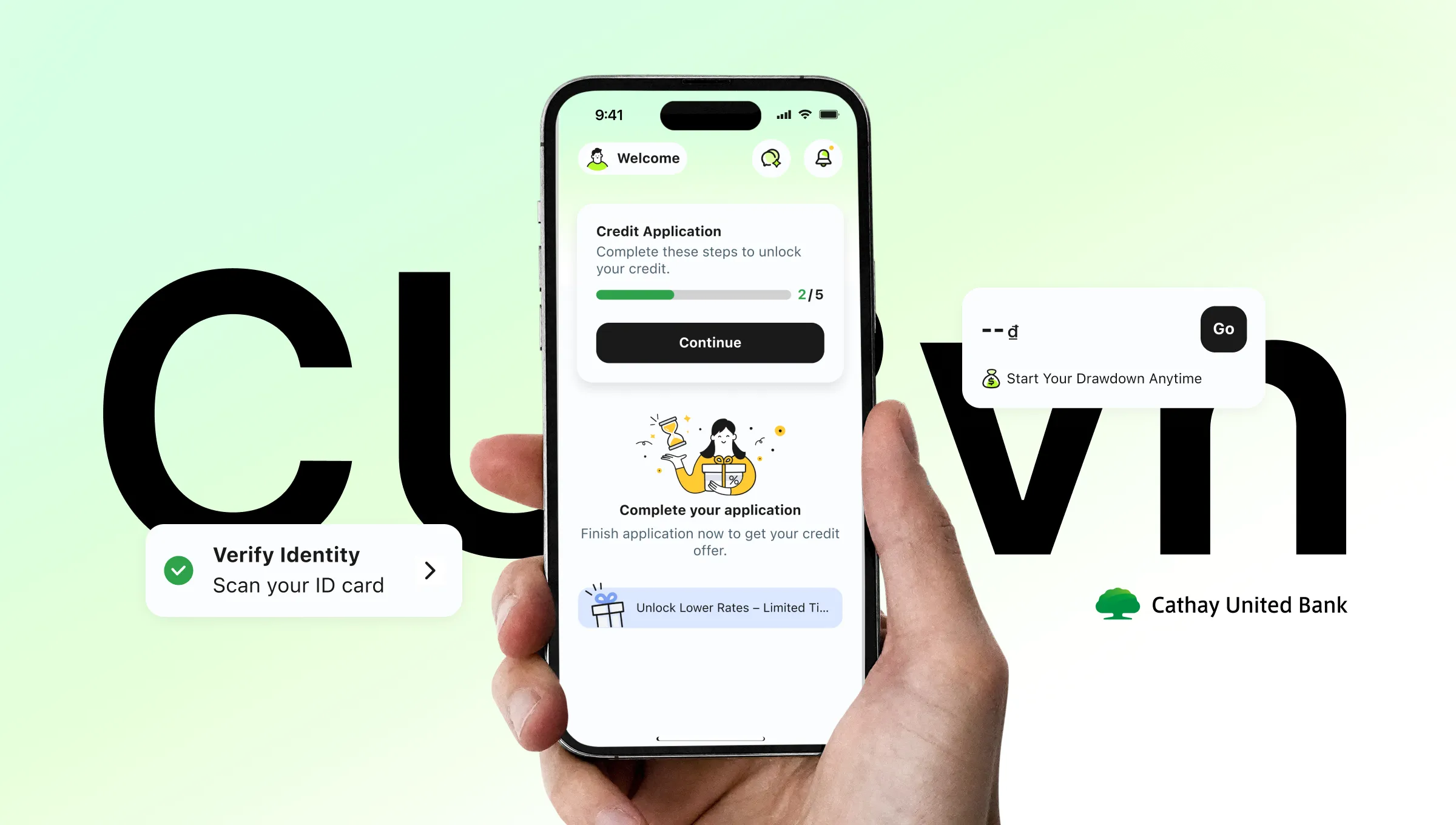
All five sections visible from one screen. Users know exactly what's ahead before they begin.
Recovery
02
Auto-save and resume
Progress saved at every step. Zalo users get verified info auto-filled — just review and confirm.
Transparency
03
Live status tracking
A progress card on the home screen shows exactly where users are, with each section showing its own completion state.
AI-Assisted Prototyping
AI-powered: from kickoff to consensus
To get the whole team on the same page fast, I use Figma Make to built an interactive Before/After prototype in our kickoff meeting. no any handoff needed. Product owners, PMs, and developers could try both flows themselves and feel the difference firsthand.


Research
From user pain to design direction — faster.
Instead of Googling best practices, I fed the drop-off data directly into FigJam AI — letting it help me structure the problem, map the user's emotional journey, and surface specific design directions for the activation page. The result wasn't a list of generic tips. It was a shared artifact the whole team could read, challenge, and build on.

AI as a Research Partner
Where the journey breaks?
In the beginning, we found out that users spent too much time and dropped off during the form-filling process. Due to tight timelines, we ran a quick in-team test with 3 members. The result was clear: when they couldn't tell how far they'd come or how much was left, they quit

Minh Anh
🇻🇳, Age 23
Once I'm a member, I'd like to instantly see my eligible loan amount and offers.

Chị Lan
🇻🇳, Age 37
I need a chance to double check my details and get a clear timeline on the approval process before I hit submit.

Văn Nam
🇻🇳, Age 42
I want a quick onboarding so I can understand the features without any guesswork.
But fixing the form wasn't enough. The funnel told us users were still leaving — just further down the road.
Usability Test - Digging deeper
Why did users stop at the last tap: Activate Credit Page?
Funnel data told us 45% of users dropped off at the activation page. We conducted a heuristic review to identify what was creating friction before running a full usability test.

45% User Leave
Without click the "Activate My Credit"
Funnel Data + Heuristic Review
Due to timeline constraints, we used funnel data and Nielsen's heuristics to pinpoint friction. A usability test was scoped as the next step.

A
No clear information hierarchy
No visual priority — illustration, countdown, credit amount, and promo banner all compete for attention. Nothing tells users what matters most.
B
Countdown creates anxiety, not direction
The deadline placed front and center pressures users before they understand what they're activating — pushing them away instead of forward.
C
"No Use, No Interest" signals the wrong thing
Reads as a warning, not a benefit. Creates pressure instead of guiding users forward.
D
CTA doesn't signal what comes next
No hint of what "Activate" triggers. First-time users lose trust before they tap.
Result
One drop-off revealed a system-wide problem
A 45% drop-off wasn't a page problem — it was a hierarchy problem. When users can't instantly read what they're getting, they don't act. We restructured the layout and realigned the visual language to match CUBC mBanking and CUBC Merchant, creating consistency across the product family.
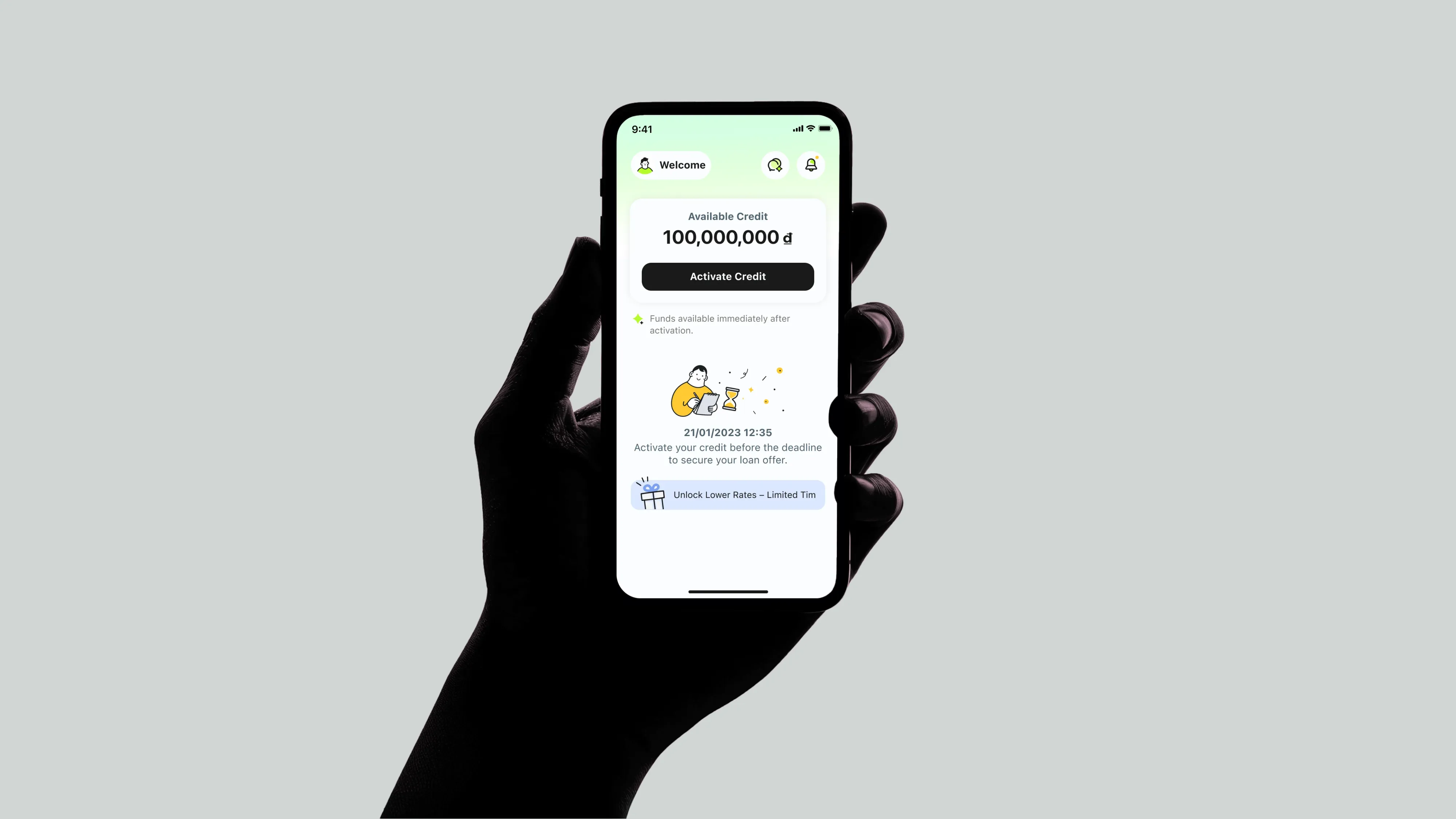
Activation Page
Lead with the credit amount
The old page threw everything at users at once — timer, amount, illustration, CTA — and none of it landed. The redesign puts one number front and center, so users know exactly what they're getting before they're asked to act.

Home Page
Title One Page, Four User States, One Consistent Voice
The old homepage used the same casual, celebratory tone regardless of where users were in their journey. The new version speaks to each state with clarity and confidence.


Modular Page
The Paradox of Choice: Why "Simple" Won
We initially bet on giving users full control (Version B). But testing revealed a plot twist: when money is on the line, 'total transparency' just feels like 'too much work.' We realized users didn't want a map to figure it out themselves — they wanted a guide to show them the way.

Testing
Due to tight timelines, we ran rapid internal testing. The results were immediate and clear:

Okay, so 'Continue' takes
me straight to the application.

What I need to do now?
Wait, where do I go to continue?


What's the difference between
'Check All' and the arrow?
What going on when I
swipe the card?

The Win with A
Version A eliminated the guesswork. Users understood the 'Continue' action instantly, resulting in a 50% faster time to task.
The Problem with B
Users on Version B struggled with Choice Paralysis. Feedback showed they were unsure which button advanced the process ('Check All' vs. 'Arrow'), leading to stalled sessions.
Tracking Plan
Measuring What Matters
We use data as a health check — not to find answers, but to ask better questions. It tells us exactly where friction lives before we talk to users.
Which element drives action?
Progress bar, title, or CTA — knowing what users tap tells us where to invest and what to cut.

50%
Reduction in low-value steps — keeping momentum high, cognitive load low.

Active vs. past contracts
Are users back to complete a task or just browse? This shapes the entire re-entry experience.
Data pinpoints the friction. User interviews explain the why.
Together, they tell us which part of the story to fix.
Result
A system fixed from the inside out
What started as a single drop-off signal became a full redesign across three connected surfaces. We didn't just fix the page — we fixed the logic behind it.
Flexibility
01
Modular Application Flow
Users can exit and return at any point without losing progress — reducing drop-off mid-application.
Conversion
02
Activation Page Rebuilt
Restructured hierarchy and refreshed visuals — aligned with the CUBC brand, built to convert.
Consistency
03
Homepage States Unified
Every user state now speaks with the same clarity and tone — one consistent voice across the entire journey.
Clear
progress tracking
One Step Away from Funds 🚀


Status of Application
Not Complete
Temporarily Save
Complete
Sign credit line agreement
After signing, users are welcomed
straight into the app
to start using their money.

New New

Credit Application

Home

Design System & Handoff
Design System for Project Management
Every UI variation traces back to a single source. Changes made once — reflected everywhere.
Foundation
Contextual Variants & Auto Layout
Every state is derived from a single parent component, built with auto layout — so spacing, structure, and resizing stay consistent across all scenarios.


Built to Hand Off
Component Spec & Handoff
Components are annotated with spacing, color tokens, and property rules, then published to the shared library — giving developers everything they need while keeping every screen in sync.
Show Spec

Accessibility
Accessible finance dynamic type for every user, iOS 26 for what's next.
Dynamic type scaling ensures every user can read comfortably — regardless of device or ability. Android goes further with horizontal layout support, while iOS 26 alignment keeps the experience native and familiar for users on the latest system.

Library
Built for scale — documented to the detail
Every component is categorized and ready to deploy. Each entry goes deeper — with Main Comp, Element breakdown, and usage rules that keep designers and developers working from the same source of truth.


My Takeaway
Users don't abandon flows because they're lazy — they abandon because no one told them where the end was. Going modular forced me to think structurally first: clear entry points, visible progress, and data that followed the user instead of making them repeat themselves. The real win wasn't the 50% faster completion time. It was designing something people could actually trust enough to finish.
Chu
0203. 2026
More to explore.
©2024-2026
CUBvn*
Timeline
1.5 months
Team
Co work with Lead Designer, PMs, iOS & Android RDs, QA Team
My Role
Product Design
About
CUBvn is a digital lending app built to make borrowing simple and human. In early 2025, the team set an aggressive goal — scale loan approvals to $100M in eight months.
30 min
Get loan as fast as 30 minutes
Fast Approved

♾️
Borrow Your Way
Always get the money when you're ready.
4+
Full digital borrowing
Borrow money with just your mobile device
3+
Trusted Local Partnerships
with Mobile World.
Team Archivement
With over 38K user ratings, we are proudly got the 4.9 stars in both apple and google app store.
0.9 🌟
0.9 🌟
Rating
High user satisfaction
0 K+
0 K+
Reviews & Ratings
Massive trust and scale across Vietnam
0+
0+
Years Running
Proven stability on iOS & Android
Team Structure
Scrum Scope in Our Team
Our team spanned Taiwan and Vietnam — different time zones, different contexts, different expectations. We ran Scrum company-wide to stay aligned. The stages below are where I was directly involved, from shaping requirements to communicating results with RD and QA.
7 Days
Requirement
Data Team
Taiwan Team
Veitnam Local Team
3 Days
Strategy
Goals
Functional
Business Ideation Stage
2 Days
Discovery
Global Research
Competitor Analysis
User Flow
Existing Function Check
UIUX Ideation Stage
7 Days
Solution
Wireframe
Testing
UI Design
Collect Inside Feedback
Design System
Prototyping
9 Days
Development
RD Team Develop
QA Team Testing
PM Check
Communicate w Teams
Result Check
Demo Fix
The Challenge
Two silent UX failures were quietly killing growth: a credit application users couldn't finish, and a verification step users couldn't pass.
Users were dropping off at two critical points — but no one knew exactly why. The credit application flow had too many steps users couldn't navigate alone. The verification step was hitting a hardware wall: users without NFC-enabled phones couldn't proceed at all. Both problems were invisible in the metrics until we dug in. This case covers Chapter 01 — fixing the application flow. Chapter 02 tackles the verification gap.
Chapter 01
From tunnel to modular credit application
Signup
linear tunnel
Loan Agreement Signing
Drawdown
Settlement
Signup
linear tunnel
Loan Agreement Signing
Drawdown
Settlement
Signup
linear tunnel
Loan Agreement Signing
Drawdown
Settlement
Problem
A lengthy credit application with no progress, no recovery, and no way out.
No progress visibility, no scope awareness, and zero tolerance for interruption — leading to high drop-off and a frustrating restart loop.
Opacity
01
No progress visibility
Users had no sense of what lay ahead: how many steps, what information to prepare, or how long it would take to finish.
No recovery
02
Drop-off means starting over
Any exit — intentional or not — wiped all progress, forcing users to restart from a blank slate.
Linear lock-in
03
Rigid, sequential structure
The strict step-by-step flow gave users no flexibility to skip, revisit, or complete sections out of order.
We tackled the problem from three angles:
Structure
01
Modular hub
All five sections visible from one screen. Users know exactly what's ahead before they begin.
Recovery
02
Auto-save and resume
Progress saved at every step. Zalo users get verified info auto-filled — just review and confirm.
Transparency
03
Live status tracking
A progress card on the home screen shows exactly where users are, with each section showing its own completion state.
AI-Assisted Prototyping
AI-powered: from kickoff to consensus
To get the whole team on the same page fast, I use Figma Make to built an interactive Before/After prototype in our kickoff meeting. no any handoff needed. Product owners, PMs, and developers could try both flows themselves and feel the difference firsthand.
Research
From user pain to design direction — faster.
Instead of Googling best practices, I fed the drop-off data directly into FigJam AI — letting it help me structure the problem, map the user's emotional journey, and surface specific design directions for the activation page. The result wasn't a list of generic tips. It was a shared artifact the whole team could read, challenge, and build on.
AI as a Research Partner
Where the journey breaks?
In the beginning, we found out that users spent too much time and dropped off during the form-filling process. Due to tight timelines, we ran a quick in-team test with 3 members. The result was clear: when they couldn't tell how far they'd come or how much was left, they quit
Minh Anh
🇻🇳, Age 23
Once I'm a member, I'd like to instantly see my eligible loan amount and offers.
Chị Lan
🇻🇳, Age 37
I need a chance to double check my details and get a clear timeline on the approval process before I hit submit.
Văn Nam
🇻🇳, Age 42
I want a quick onboarding so I can understand the features without any guesswork.
But fixing the form wasn't enough. The funnel told us users were still leaving — just further down the road.
Usability Test - Digging deeper
Why did users stop at the last tap: Activate Credit Page?
Funnel data told us 45% of users dropped off at the activation page. We conducted a heuristic review to identify what was creating friction before running a full usability test.
45% User Leave
Without click the "Activate My Credit"
Funnel Data + Heuristic Review
Due to timeline constraints, we used funnel data and Nielsen's heuristics to pinpoint friction. A usability test was scoped as the next step.
A
No clear information hierarchy
No visual priority — illustration, countdown, credit amount, and promo banner all compete for attention. Nothing tells users what matters most.
B
Countdown creates anxiety, not direction
The deadline placed front and center pressures users before they understand what they're activating — pushing them away instead of forward.
C
"No Use, No Interest" signals the wrong thing
Reads as a warning, not a benefit. Creates pressure instead of guiding users forward.
D
CTA doesn't signal what comes next
No hint of what "Activate" triggers. First-time users lose trust before they tap.
Result
One drop-off revealed a system-wide problem
A 45% drop-off wasn't a page problem — it was a hierarchy problem. When users can't instantly read what they're getting, they don't act. We restructured the layout and realigned the visual language to match CUBC mBanking and CUBC Merchant, creating consistency across the product family.
Activation Page
Lead with the credit amount
The old page threw everything at users at once — timer, amount, illustration, CTA — and none of it landed. The redesign puts one number front and center, so users know exactly what they're getting before they're asked to act.
Home Page
Title One Page, Four User States, One Consistent Voice
The old homepage used the same casual, celebratory tone regardless of where users were in their journey. The new version speaks to each state with clarity and confidence.
Modular Page
The Paradox of Choice: Why "Simple" Won
We initially bet on giving users full control (Version B). But testing revealed a plot twist: when money is on the line, 'total transparency' just feels like 'too much work.' We realized users didn't want a map to figure it out themselves — they wanted a guide to show them the way.
Testing
Due to tight timelines, we ran rapid internal testing. The results were immediate and clear:
Okay, so 'Continue' takes
me straight to the application.
What I need to do now?
Wait, where do I go to continue?
What's the difference between
'Check All' and the arrow?
What going on when I
swipe the card?
The Win with A
Version A eliminated the guesswork. Users understood the 'Continue' action instantly, resulting in a 50% faster time to task.
The Problem with B
Users on Version B struggled with Choice Paralysis. Feedback showed they were unsure which button advanced the process ('Check All' vs. 'Arrow'), leading to stalled sessions.
Tracking Plan
Measuring What Matters
We use data as a health check — not to find answers, but to ask better questions. It tells us exactly where friction lives before we talk to users.
Which element drives action?
Progress bar, title, or CTA — knowing what users tap tells us where to invest and what to cut.
50%
Reduction in low-value steps — keeping momentum high, cognitive load low.
Active vs. past contracts
Are users back to complete a task or just browse? This shapes the entire re-entry experience.
Data pinpoints the friction. User interviews explain the why.
Together, they tell us which part of the story to fix.
Result
A system fixed from the inside out
What started as a single drop-off signal became a full redesign across three connected surfaces. We didn't just fix the page — we fixed the logic behind it.
Flexibility
01
Modular Application Flow
Users can exit and return at any point without losing progress — reducing drop-off mid-application.
Conversion
02
Activation Page Rebuilt
Restructured hierarchy and refreshed visuals — aligned with the CUBC brand, built to convert.
Consistency
03
Homepage States Unified
Every user state now speaks with the same clarity and tone — one consistent voice across the entire journey.
Clear
progress tracking
One Step Away from Funds 🚀
Status of Application
Not Complete
Temporarily Save
Complete
Sign credit line agreement
After signing, users are welcomed
straight into the app
to start using their money.
New New
Credit Application
Home
Design System & Handoff
Design System for Project Management
Every UI variation traces back to a single source. Changes made once — reflected everywhere.
Foundation
Contextual Variants & Auto Layout
Every state is derived from a single parent component, built with auto layout — so spacing, structure, and resizing stay consistent across all scenarios.
Built to Hand Off
Component Spec & Handoff
Components are annotated with spacing, color tokens, and property rules, then published to the shared library — giving developers everything they need while keeping every screen in sync.
Show Spec
Accessibility
Accessible finance dynamic type for every user, iOS 26 for what's next.
Dynamic type scaling ensures every user can read comfortably — regardless of device or ability. Android goes further with horizontal layout support, while iOS 26 alignment keeps the experience native and familiar for users on the latest system.
Library
Built for scale — documented to the detail
Every component is categorized and ready to deploy. Each entry goes deeper — with Main Comp, Element breakdown, and usage rules that keep designers and developers working from the same source of truth.
My Takeaway
Users don't abandon flows because they're lazy — they abandon because no one told them where the end was. Going modular forced me to think structurally first: clear entry points, visible progress, and data that followed the user instead of making them repeat themselves. The real win wasn't the 50% faster completion time. It was designing something people could actually trust enough to finish.
Chu
0203. 2026
More to explore.
©2024-2026
CUBvn*
Timeline
1.5 months
Team
Co work with Lead Designer, PMs, iOS & Android RDs, QA Team
My Role
Product Design
About
CUBvn is a digital lending app built to make borrowing simple and human. In early 2025, the team set an aggressive goal — scale loan approvals to $100M in eight months.
30 min
Get loan as fast as 30 minutes
Fast Approved
♾️
Borrow Your Way
Always get the money when you're ready.
4+
Full digital borrowing
Borrow money with just your mobile device
3+
Trusted Local Partnerships
with Mobile World.
Team Archivement
With over 38K user ratings, we are proudly got the 4.9 stars in both apple and google app store.
0.9 🌟
0.9 🌟
Rating
High user satisfaction
0 K+
0 K+
Reviews & Ratings
Massive trust and scale across Vietnam
0+
0+
Years Running
Proven stability on iOS & Android
Team Structure
Scrum Scope in Our Team
Our team spanned Taiwan and Vietnam — different time zones, different contexts, different expectations. We ran Scrum company-wide to stay aligned. The stages below are where I was directly involved, from shaping requirements to communicating results with RD and QA.
7 Days
Requirement
Data Team
Taiwan Team
Veitnam Local Team
3 Days
Strategy
Goals
Functional
Business Ideation Stage
2 Days
Discovery
Global Research
Competitor Analysis
User Flow
Existing Function Check
UIUX Ideation Stage
7 Days
Solution
Wireframe
Testing
UI Design
Collect Inside Feedback
Design System
Prototyping
9 Days
Development
RD Team Develop
QA Team Testing
PM Check
Communicate w Teams
Result Check
Demo Fix
The Challenge
Two silent UX failures were quietly killing growth: a credit application users couldn't finish, and a verification step users couldn't pass.
Users were dropping off at two critical points — but no one knew exactly why. The credit application flow had too many steps users couldn't navigate alone. The verification step was hitting a hardware wall: users without NFC-enabled phones couldn't proceed at all. Both problems were invisible in the metrics until we dug in. This case covers Chapter 01 — fixing the application flow. Chapter 02 tackles the verification gap.
Chapter 01
From tunnel to modular credit application
Signup
linear tunnel
Loan Agreement Signing
Drawdown
Settlement
Signup
linear tunnel
Loan Agreement Signing
Drawdown
Settlement
Signup
linear tunnel
Loan Agreement Signing
Drawdown
Settlement
Problem
A lengthy credit application with no progress, no recovery, and no way out.
No progress visibility, no scope awareness, and zero tolerance for interruption — leading to high drop-off and a frustrating restart loop.
Opacity
01
No progress visibility
Users had no sense of what lay ahead: how many steps, what information to prepare, or how long it would take to finish.
No recovery
02
Drop-off means starting over
Any exit — intentional or not — wiped all progress, forcing users to restart from a blank slate.
Linear lock-in
03
Rigid, sequential structure
The strict step-by-step flow gave users no flexibility to skip, revisit, or complete sections out of order.
We tackled the problem from three angles:
Structure
01
Modular hub
All five sections visible from one screen. Users know exactly what's ahead before they begin.
Recovery
02
Auto-save and resume
Progress saved at every step. Zalo users get verified info auto-filled — just review and confirm.
Transparency
03
Live status tracking
A progress card on the home screen shows exactly where users are, with each section showing its own completion state.
AI-Assisted Prototyping
AI-powered: from kickoff to consensus
To get the whole team on the same page fast, I use Figma Make to built an interactive Before/After prototype in our kickoff meeting. no any handoff needed. Product owners, PMs, and developers could try both flows themselves and feel the difference firsthand.
Research
From user pain to design direction — faster.
Instead of Googling best practices, I fed the drop-off data directly into FigJam AI — letting it help me structure the problem, map the user's emotional journey, and surface specific design directions for the activation page. The result wasn't a list of generic tips. It was a shared artifact the whole team could read, challenge, and build on.
AI as a Research Partner
Where the journey breaks?
In the beginning, we found out that users spent too much time and dropped off during the form-filling process. Due to tight timelines, we ran a quick in-team test with 3 members. The result was clear: when they couldn't tell how far they'd come or how much was left, they quit
Minh Anh
🇻🇳, Age 23
Once I'm a member, I'd like to instantly see my eligible loan amount and offers.
Chị Lan
🇻🇳, Age 37
I need a chance to double check my details and get a clear timeline on the approval process before I hit submit.
Văn Nam
🇻🇳, Age 42
I want a quick onboarding so I can understand the features without any guesswork.
But fixing the form wasn't enough. The funnel told us users were still leaving — just further down the road.
Usability Test - Digging deeper
Why did users stop at the last tap: Activate Credit Page?
Funnel data told us 45% of users dropped off at the activation page. We conducted a heuristic review to identify what was creating friction before running a full usability test.
45% User Leave
Without click the "Activate My Credit"
Funnel Data + Heuristic Review
Due to timeline constraints, we used funnel data and Nielsen's heuristics to pinpoint friction. A usability test was scoped as the next step.
A
No clear information hierarchy
No visual priority — illustration, countdown, credit amount, and promo banner all compete for attention. Nothing tells users what matters most.
B
Countdown creates anxiety, not direction
The deadline placed front and center pressures users before they understand what they're activating — pushing them away instead of forward.
C
"No Use, No Interest" signals the wrong thing
Reads as a warning, not a benefit. Creates pressure instead of guiding users forward.
D
CTA doesn't signal what comes next
No hint of what "Activate" triggers. First-time users lose trust before they tap.
Result
One drop-off revealed a system-wide problem
A 45% drop-off wasn't a page problem — it was a hierarchy problem. When users can't instantly read what they're getting, they don't act. We restructured the layout and realigned the visual language to match CUBC mBanking and CUBC Merchant, creating consistency across the product family.
Activation Page
Lead with the credit amount
The old page threw everything at users at once — timer, amount, illustration, CTA — and none of it landed. The redesign puts one number front and center, so users know exactly what they're getting before they're asked to act.
Home Page
Title One Page, Four User States, One Consistent Voice
The old homepage used the same casual, celebratory tone regardless of where users were in their journey. The new version speaks to each state with clarity and confidence.
Modular Page
The Paradox of Choice: Why "Simple" Won
We initially bet on giving users full control (Version B). But testing revealed a plot twist: when money is on the line, 'total transparency' just feels like 'too much work.' We realized users didn't want a map to figure it out themselves — they wanted a guide to show them the way.
Testing
Due to tight timelines, we ran rapid internal testing. The results were immediate and clear:
Okay, so 'Continue' takes
me straight to the application.
What I need to do now?
Wait, where do I go to continue?
What's the difference between
'Check All' and the arrow?
What going on when I
swipe the card?
The Win with A
Version A eliminated the guesswork. Users understood the 'Continue' action instantly, resulting in a 50% faster time to task.
The Problem with B
Users on Version B struggled with Choice Paralysis. Feedback showed they were unsure which button advanced the process ('Check All' vs. 'Arrow'), leading to stalled sessions.
Tracking Plan
Measuring What Matters
We use data as a health check — not to find answers, but to ask better questions. It tells us exactly where friction lives before we talk to users.
Which element drives action?
Progress bar, title, or CTA — knowing what users tap tells us where to invest and what to cut.
50%
Reduction in low-value steps — keeping momentum high, cognitive load low.
Active vs. past contracts
Are users back to complete a task or just browse? This shapes the entire re-entry experience.
Data pinpoints the friction. User interviews explain the why.
Together, they tell us which part of the story to fix.
Result
A system fixed from the inside out
What started as a single drop-off signal became a full redesign across three connected surfaces. We didn't just fix the page — we fixed the logic behind it.
Flexibility
01
Modular Application Flow
Users can exit and return at any point without losing progress — reducing drop-off mid-application.
Conversion
02
Activation Page Rebuilt
Restructured hierarchy and refreshed visuals — aligned with the CUBC brand, built to convert.
Consistency
03
Homepage States Unified
Every user state now speaks with the same clarity and tone — one consistent voice across the entire journey.
Clear
progress tracking
One Step Away from Funds 🚀
Status of Application
Not Complete
Temporarily Save
Complete
Sign credit line agreement
After signing, users are welcomed
straight into the app
to start using their money.
New New
Credit Application
Home
Design System & Handoff
Design System for Project Management
Every UI variation traces back to a single source. Changes made once — reflected everywhere.
Foundation
Contextual Variants & Auto Layout
Every state is derived from a single parent component, built with auto layout — so spacing, structure, and resizing stay consistent across all scenarios.
Built to Hand Off
Component Spec & Handoff
Components are annotated with spacing, color tokens, and property rules, then published to the shared library — giving developers everything they need while keeping every screen in sync.
Show Spec
Accessibility
Accessible finance dynamic type for every user, iOS 26 for what's next.
Dynamic type scaling ensures every user can read comfortably — regardless of device or ability. Android goes further with horizontal layout support, while iOS 26 alignment keeps the experience native and familiar for users on the latest system.
Library
Built for scale — documented to the detail
Every component is categorized and ready to deploy. Each entry goes deeper — with Main Comp, Element breakdown, and usage rules that keep designers and developers working from the same source of truth.
My Takeaway
Users don't abandon flows because they're lazy — they abandon because no one told them where the end was. Going modular forced me to think structurally first: clear entry points, visible progress, and data that followed the user instead of making them repeat themselves. The real win wasn't the 50% faster completion time. It was designing something people could actually trust enough to finish.
Chu
0203. 2026