©2023-2024
Seedling*
Seedling
Timeline
2023 - 2024
Team
Co work with CEO, Content writer, Develoment team
My Role
Product Design, Brand Design, Product Strategy
About
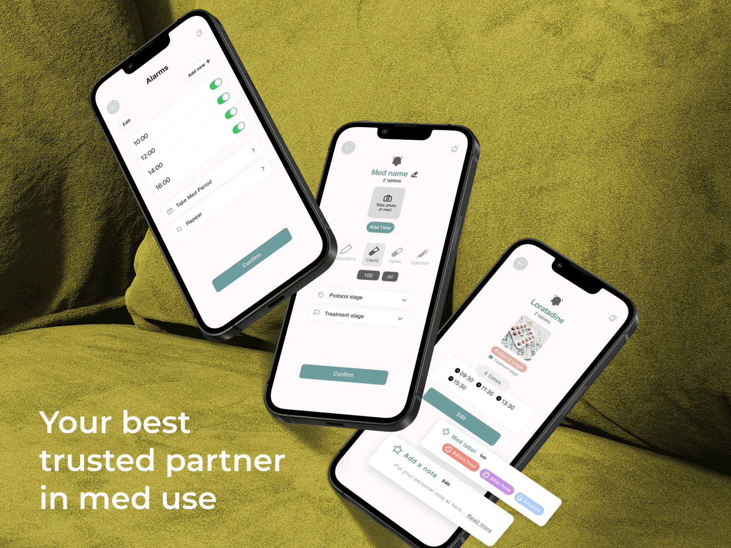
Seedling — Your Fertility Companion App
1.3 billion people are on a fertility journey. For many, it's not just physically demanding — it's an overwhelming tangle of medications, schedules, and appointments. Seedling brings order to the chaos, so people can focus on what actually matters.
What We Do
Fertility is hard enough. Managing it shouldn't be.
We built Seedling because fertility treatment is already hard enough — injections, blood tests, constant scheduling, and the emotional weight of it all. Seedling pulls everything into one place, so the logistics never get in the way of what you're actually fighting for.
Track medications
Doses, timing, and refills — all in one place, never missed.
Organise appointments
Doctor visits, scans, and follow-ups, clearly mapped out.
Stay supported
No more going it alone. Seedling keeps you grounded.

Challenge for individual
3.5 millions
People face different fertility challenge in UK.
Target user
20s - 45s
Global reach, with a particular focus on UK.
Target user
Launched MVP First
Boost our conversion rate by 20-30% with version 2.0. We'll also keep updating the app and add a subscription feature when it's time.
Problem
Initial Research
Based on 17 survey responses and 3 in-depth interviews, we found that people undergoing fertility treatments struggle to keep track of their medications, doses, and appointments — a burden that leads to missed doses, less effective treatment, and significant emotional stress.
Helpful advice & support
Often face a one-size-fits-all approach to treatment.

Organising & Keeping track with reminders
Lead to confusion or mistakes in medication or treatment
Bring everyone along for the ride
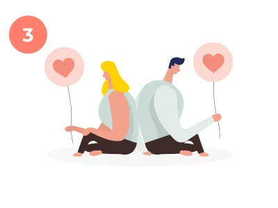
Face uncertainty and high stakes alone
Solution
iOS MVP version
For our MVP version, we've made sure user can keep track of all their daily tasks easily right off the bat. This way, they've got a handy reminder to help sort out all those complicated to-dos. We did this because we know how easy it is to get swamped by everything you've got to do. With our app, we're giving user a little extra help to make things less stressful when they kick off the fertility journey.
Research & Analytics
Primary & Competitive Research
In previous research, we got 17 detailed survey responses for main 15 questions that lead to the core experience in fertility and 3 interviews from user about 35-44 years old. Alongside this, we engaged in secondary research, which included reviewing feedback about our competitor and the product user commonly use. This approach us to build a comprehensive understanding of our users' needs.
Key Mertrics
User Insights

77%
Felt confused and lacked clear guidance at the start of their fertility journey.
62.5%
Wanted a simple way to track medications, appointments, and dosages — especially when treatment gets complex.
56%
Identified emotional strain — stress, hopelessness, and difficulty staying positive — as their biggest challenge when a treatment cycle fails.
Delivery
Making fertility treatments simpler to grasp, easier to manage, and more supportive
77% of users felt overwhelmed simply because they didn't know what to expect next. When the process is laid out clearly, step by step, anxiety drops. Most fear comes from uncertainty — and that's exactly what Seedling addresses.

50%
Joined online forums to seek information and peer support.
77%
Preferred connecting with others in similar situations.
50%
Already using multiple tools to track their fertility journey.

37.5% - 81.2%
Open to using digital tools to support their fertility journey.
70%
Craving real connection with others going through the same experience.
62.5%
Want a daily tool to help manage treatment and related tasks.
Warm, human guidance
Advice that feels like a friend, not a doctor.
Emotional support, built in
Tools to help users cope with the emotional weight of treatment.
Track what matters
Medications, dosages, appointments — all logged without friction.
Everything in one place
No more switching between apps. One place for the whole journey.
Community & shared experience
Connect with others, share stories, and feel less alone.
Guidance that fits you
Personalised information that speaks to what each user is facing.
Prioritisation Matrix
We focus key solutions in MVP version first
In alignment with our planned MVP release schedule, we've prioritised the development of four key solutions and two primary features.
Dive into design
Design Principles
Our design principles were grounded in user research and data — shaping every decision from layout to tone.
Emotional support
Every word and interaction is considered — nothing in the app should feel harsh, cold, or add to the user's stress.
Once action per screen
Each screen has a single, clear purpose — so users always know exactly what to do next.
Intuitive & Easy to use
Consistent patterns and familiar interactions keep the experience feeling simple, even when the subject matter isn't.
Seamlessness
Users move through the app smoothly from start to finish — no confusion, no dead ends.

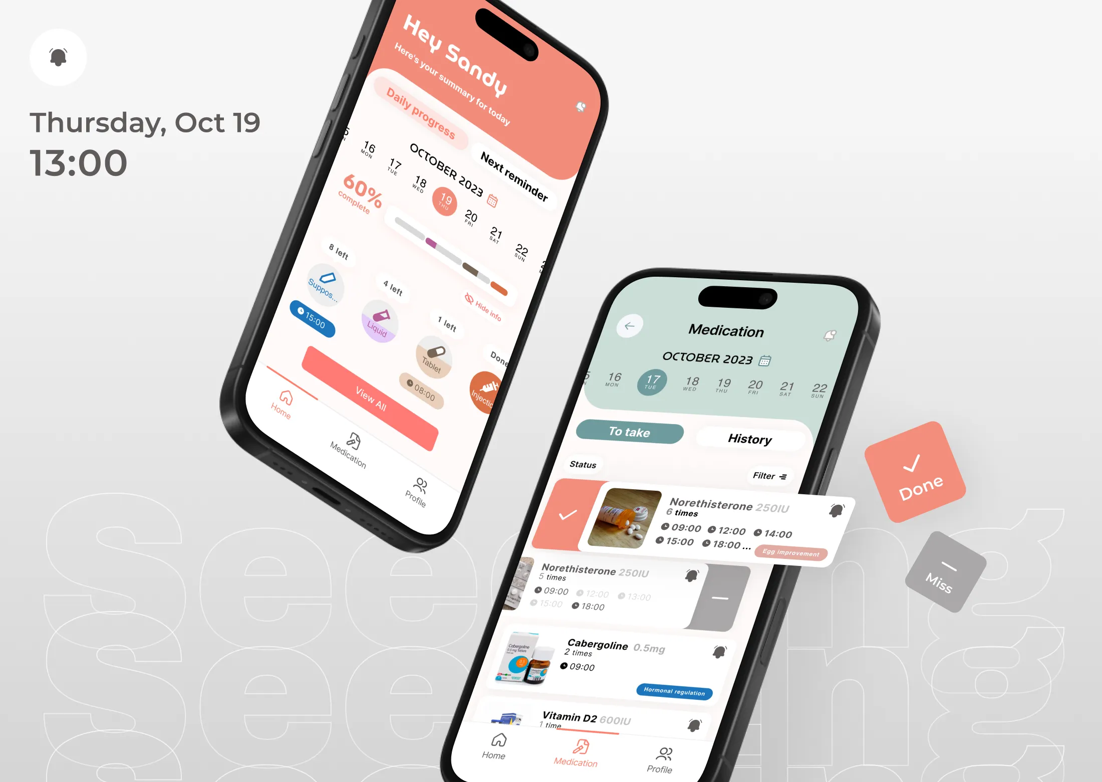
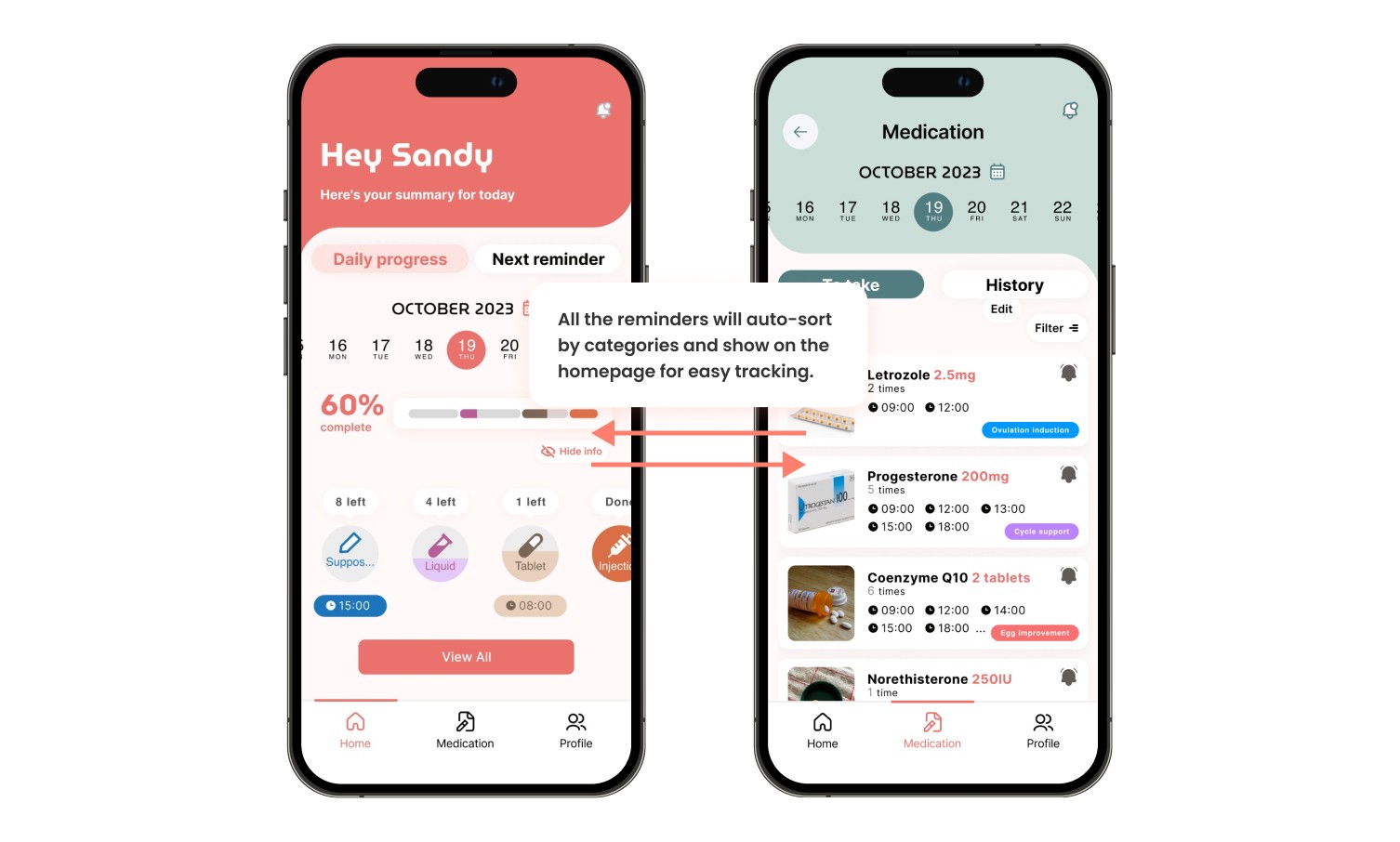
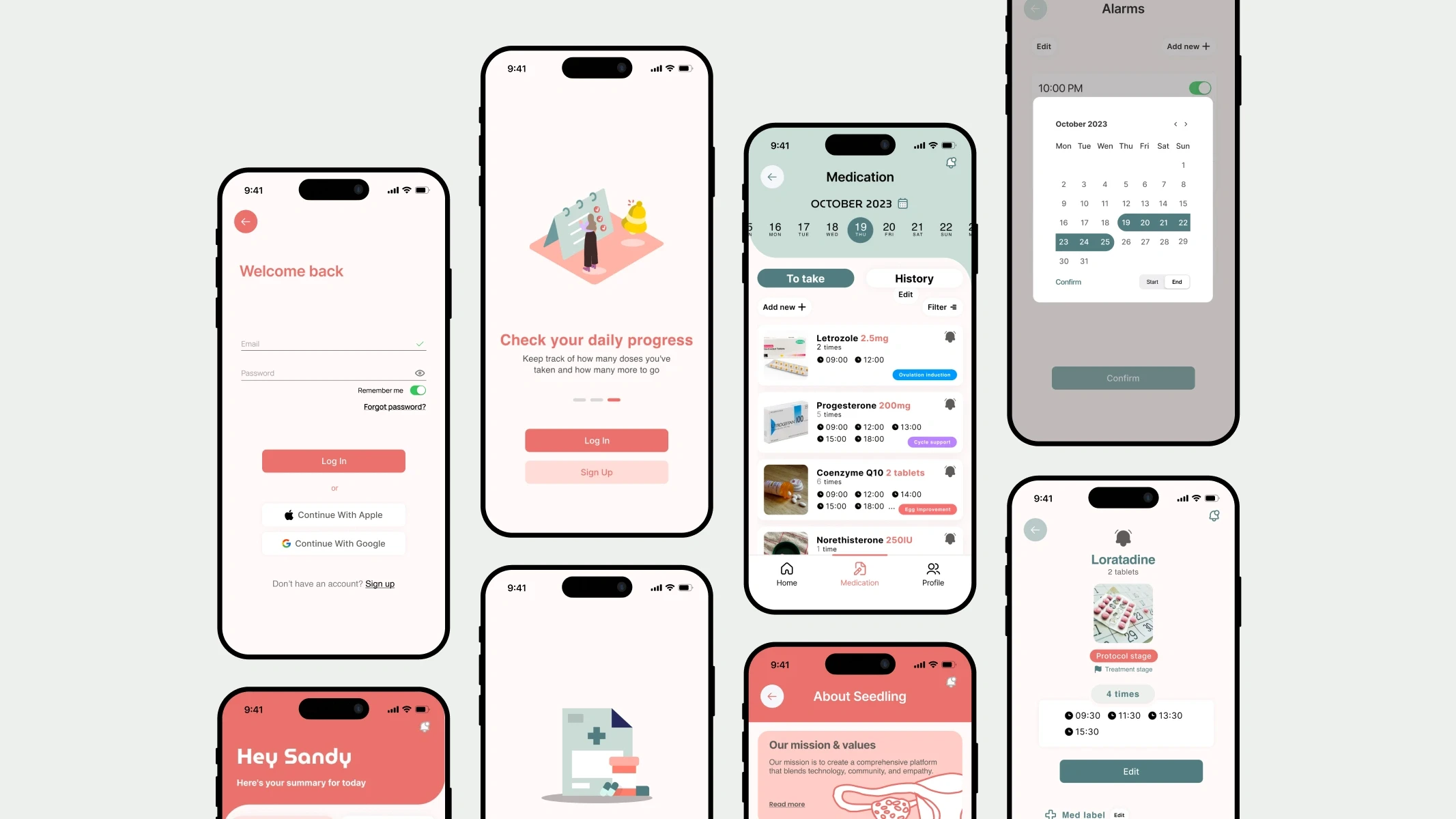
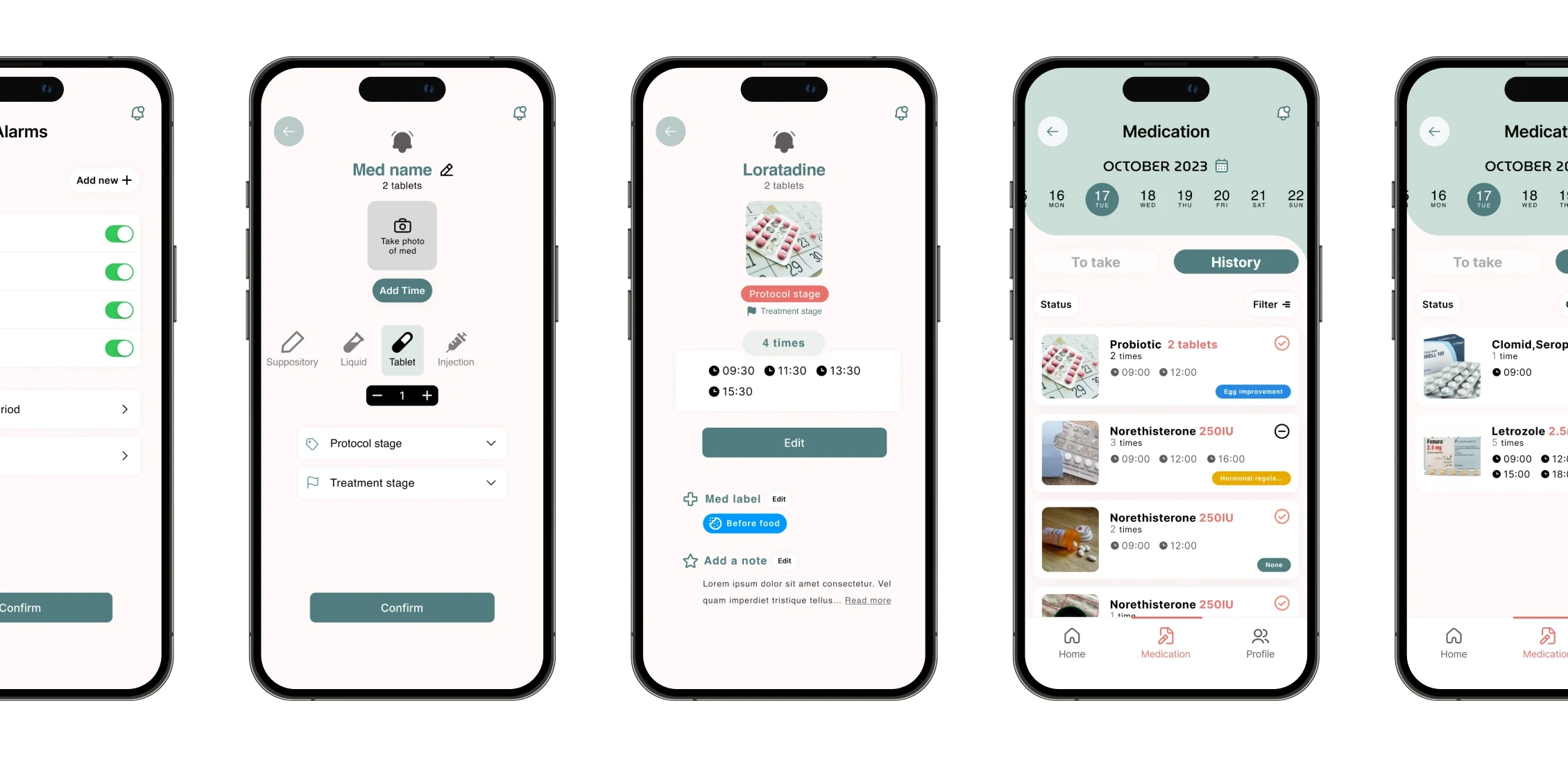
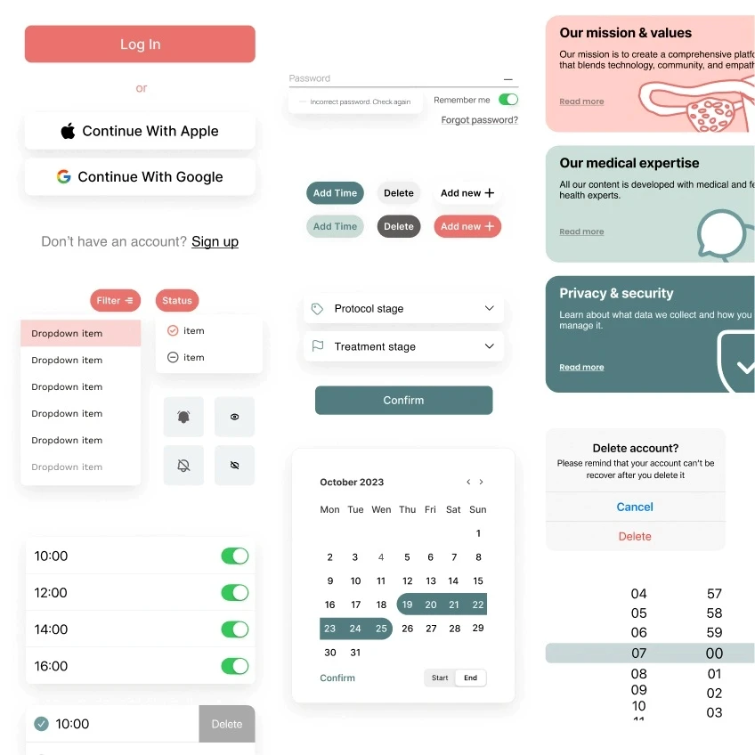
Progress & Reminders
Daily Tracking
See your medications, reminders, and daily progress at a glance — so nothing gets missed.
Organisation
Medication Management
All your medications in one place, with dosage details, timing, and treatment stages clearly laid out.
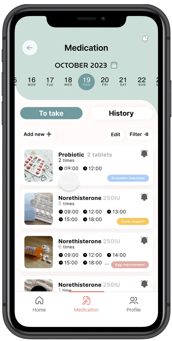
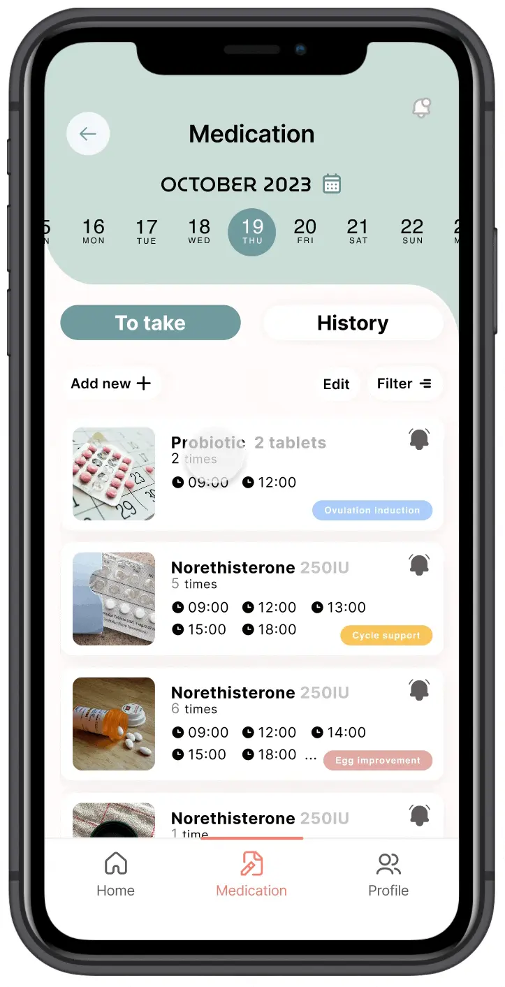
Treatment Log
Log and review your full treatment history — making it easier to track progress and inform future care.
Medication History
Log and review your full treatment history — making it easier to track progress and inform future care.
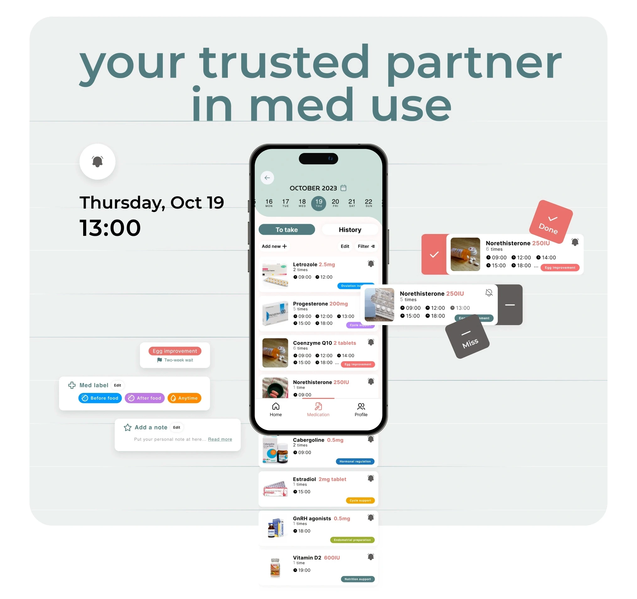
Effortless med entry
Snap a photo to instantly capture medication details and log them into your treatment plan — no typing required.
Organised tag system
Sort medications by type, treatment phase, or custom category — so finding what you need is always quick.
Personalised reminders
Set reminders that fit your schedule and never miss a dose.
Treatment history log
Every step of your treatment is recorded and stored — giving you a clear timeline to look back on and share with your care team.
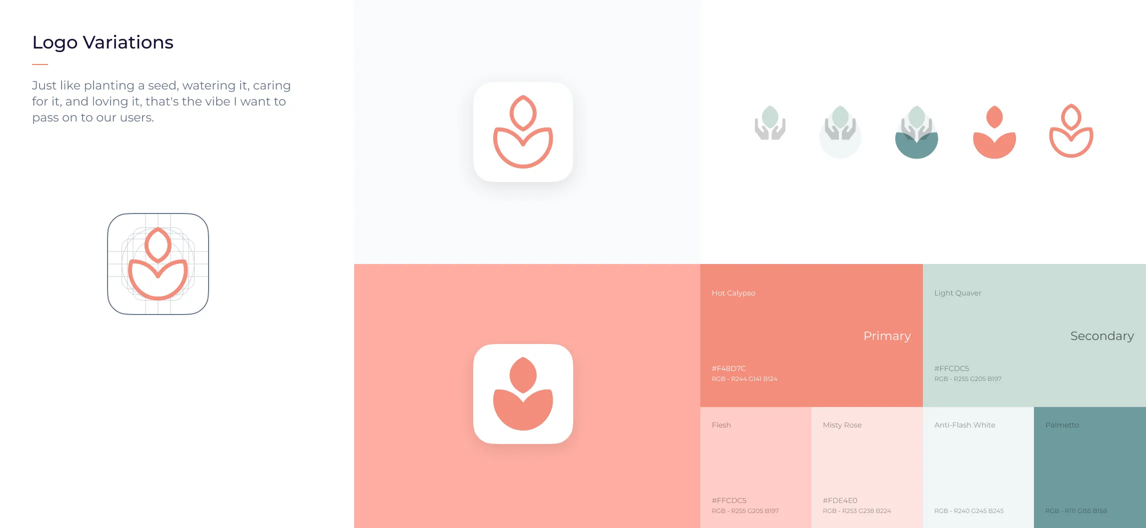
Design System
Specific Design System of Seedling
A cohesive set of components built to keep the experience clear, consistent, and calming. Every design decision — from typography to colour — was made to help users feel informed and in control, not overwhelmed.
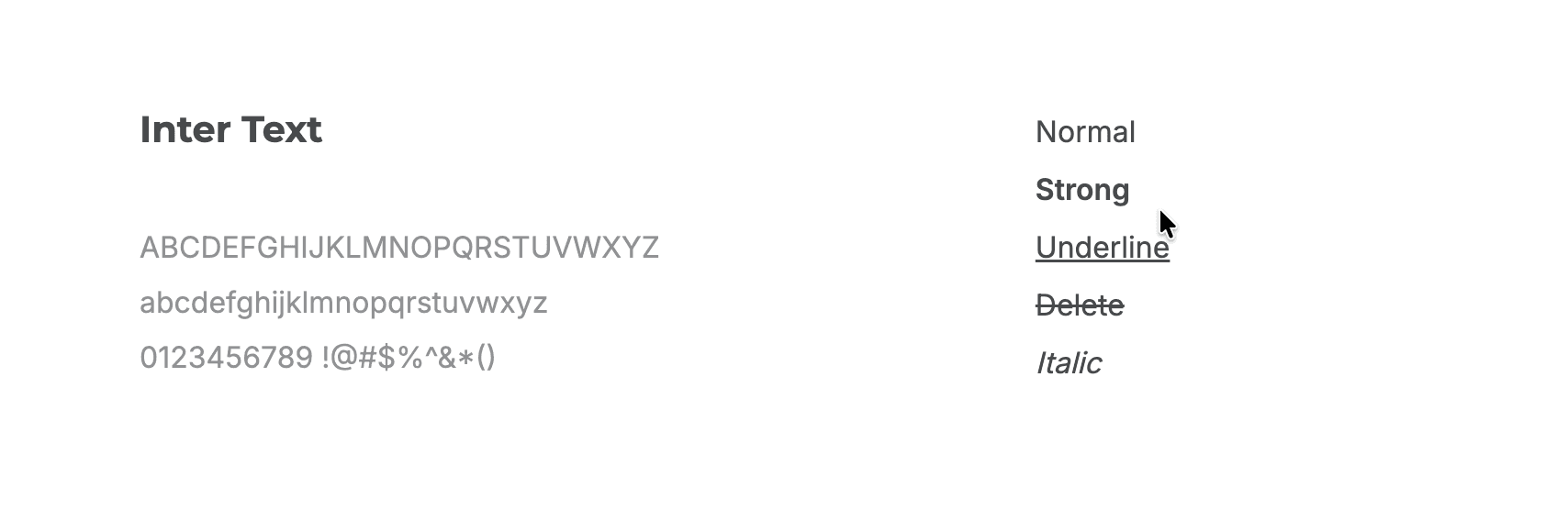
Font Family
The default interface font of the system is Inter Text, suitable for both iOS & Android screen display and ensuring readability across different platforms and browsers. It’s a neutral, flexible, sans-serif typeface with various styles.
My Takeaway
Building a product from zero in a startup means no one hands you a brief — you write it yourself. As the only designer, I learned to move fast without losing structure: clarifying requirements, mapping flows, and shipping screens often in the same week. The hardest part wasn't the design. It was knowing what to build first when everything felt urgent. That forced me to think like a founder, not just a designer — every decision had to serve the product, not just the pixel. Working at this speed taught me that good enough and shipped beats perfect and stuck. But it also showed me where cutting corners costs you later — and how to tell the difference in the moment.
Chu
2512. 2023
More to explore.


©2023-2024
Seedling*
Seedling
Timeline
2023 - 2024
Team
Co work with CEO, Content writer, Develoment team
My Role
Product Design, Brand Design, Product Strategy
About
Seedling — Your Fertility Companion App
1.3 billion people are on a fertility journey. For many, it's not just physically demanding — it's an overwhelming tangle of medications, schedules, and appointments. Seedling brings order to the chaos, so people can focus on what actually matters.
What We Do
Fertility is hard enough. Managing it shouldn't be.
We built Seedling because fertility treatment is already hard enough — injections, blood tests, constant scheduling, and the emotional weight of it all. Seedling pulls everything into one place, so the logistics never get in the way of what you're actually fighting for.
Track medications
Doses, timing, and refills — all in one place, never missed.
Organise appointments
Doctor visits, scans, and follow-ups, clearly mapped out.
Stay supported
No more going it alone. Seedling keeps you grounded.
Challenge for individual
3.5 millions
People face different fertility challenge in UK.
Target user
20s - 45s
Global reach, with a particular focus on UK.
Target user
Launched MVP First
Boost our conversion rate by 20-30% with version 2.0. We'll also keep updating the app and add a subscription feature when it's time.
Problem
Initial Research
Based on 17 survey responses and 3 in-depth interviews, we found that people undergoing fertility treatments struggle to keep track of their medications, doses, and appointments — a burden that leads to missed doses, less effective treatment, and significant emotional stress.
Helpful advice & support
Often face a one-size-fits-all approach to treatment.
Organising & Keeping track with reminders
Lead to confusion or mistakes in medication or treatment
Bring everyone along for the ride
Face uncertainty and high stakes alone
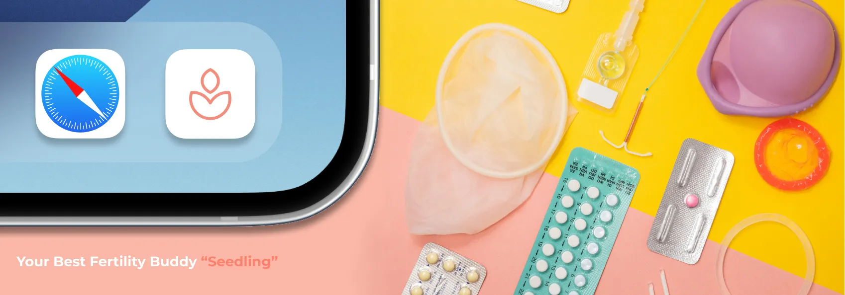
Solution
iOS MVP version
For our MVP version, we've made sure user can keep track of all their daily tasks easily right off the bat. This way, they've got a handy reminder to help sort out all those complicated to-dos. We did this because we know how easy it is to get swamped by everything you've got to do. With our app, we're giving user a little extra help to make things less stressful when they kick off the fertility journey.
Research & Analytics
Primary & Competitive Research
In previous research, we got 17 detailed survey responses for main 15 questions that lead to the core experience in fertility and 3 interviews from user about 35-44 years old. Alongside this, we engaged in secondary research, which included reviewing feedback about our competitor and the product user commonly use. This approach us to build a comprehensive understanding of our users' needs.
Key Mertrics
User Insights
77%
Felt confused and lacked clear guidance at the start of their fertility journey.
62.5%
Wanted a simple way to track medications, appointments, and dosages — especially when treatment gets complex.
56%
Identified emotional strain — stress, hopelessness, and difficulty staying positive — as their biggest challenge when a treatment cycle fails.
Delivery
Making fertility treatments simpler to grasp, easier to manage, and more supportive
77% of users felt overwhelmed simply because they didn't know what to expect next. When the process is laid out clearly, step by step, anxiety drops. Most fear comes from uncertainty — and that's exactly what Seedling addresses.
50%
Joined online forums to seek information and peer support.
77%
Preferred connecting with others in similar situations.
50%
Already using multiple tools to track their fertility journey.
37.5% - 81.2%
Open to using digital tools to support their fertility journey.
70%
Craving real connection with others going through the same experience.
62.5%
Want a daily tool to help manage treatment and related tasks.
Warm, human guidance
Advice that feels like a friend, not a doctor.
Emotional support, built in
Tools to help users cope with the emotional weight of treatment.
Track what matters
Medications, dosages, appointments — all logged without friction.
Everything in one place
No more switching between apps. One place for the whole journey.
Community & shared experience
Connect with others, share stories, and feel less alone.
Guidance that fits you
Personalised information that speaks to what each user is facing.
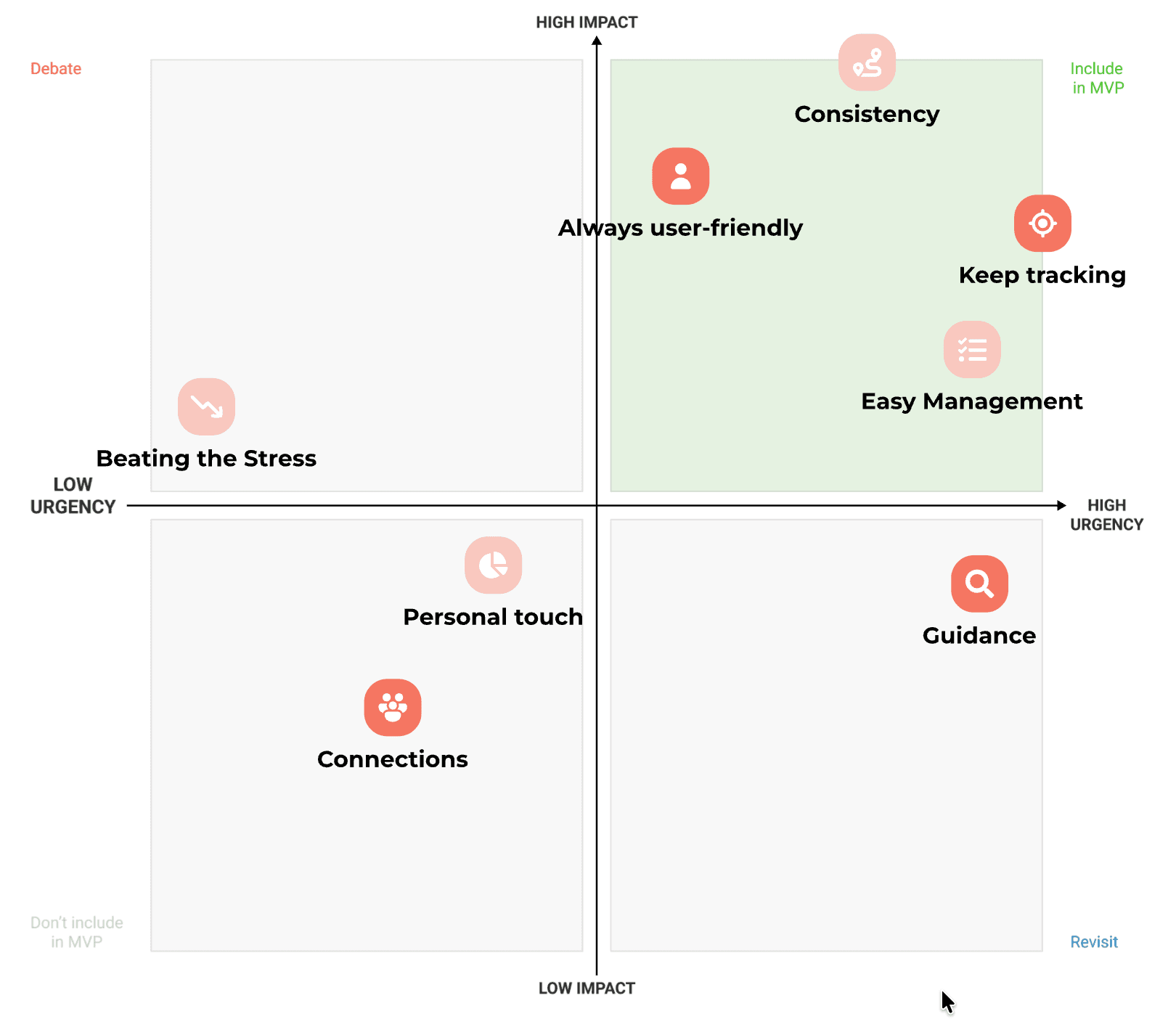
Prioritisation Matrix
We focus key solutions in MVP version first
In alignment with our planned MVP release schedule, we've prioritised the development of four key solutions and two primary features.
Dive into design
Design Principles
Our design principles were grounded in user research and data — shaping every decision from layout to tone.
Emotional support
Every word and interaction is considered — nothing in the app should feel harsh, cold, or add to the user's stress.
Once action per screen
Each screen has a single, clear purpose — so users always know exactly what to do next.
Intuitive & Easy to use
Consistent patterns and familiar interactions keep the experience feeling simple, even when the subject matter isn't.
Seamlessness
Users move through the app smoothly from start to finish — no confusion, no dead ends.
Progress & Reminders
Daily Tracking
See your medications, reminders, and daily progress at a glance — so nothing gets missed.
Organisation
Medication Management
All your medications in one place, with dosage details, timing, and treatment stages clearly laid out.
Treatment Log
Log and review your full treatment history — making it easier to track progress and inform future care.
Medication History
Log and review your full treatment history — making it easier to track progress and inform future care.
Effortless med entry
Snap a photo to instantly capture medication details and log them into your treatment plan — no typing required.
Organised tag system
Sort medications by type, treatment phase, or custom category — so finding what you need is always quick.
Personalised reminders
Set reminders that fit your schedule and never miss a dose.
Treatment history log
Every step of your treatment is recorded and stored — giving you a clear timeline to look back on and share with your care team.
Design System
Specific Design System of Seedling
A cohesive set of components built to keep the experience clear, consistent, and calming. Every design decision — from typography to colour — was made to help users feel informed and in control, not overwhelmed.
Font Family
The default interface font of the system is Inter Text, suitable for both iOS & Android screen display and ensuring readability across different platforms and browsers. It’s a neutral, flexible, sans-serif typeface with various styles.
My Takeaway
Building a product from zero in a startup means no one hands you a brief — you write it yourself. As the only designer, I learned to move fast without losing structure: clarifying requirements, mapping flows, and shipping screens often in the same week. The hardest part wasn't the design. It was knowing what to build first when everything felt urgent. That forced me to think like a founder, not just a designer — every decision had to serve the product, not just the pixel. Working at this speed taught me that good enough and shipped beats perfect and stuck. But it also showed me where cutting corners costs you later — and how to tell the difference in the moment.
Chu
2512. 2023
More to explore.
©2023-2024
Seedling*
Seedling
Timeline
2023 - 2024
Team
Co work with CEO, Content writer, Develoment team
My Role
Product Design, Brand Design, Product Strategy
About
Seedling — Your Fertility Companion App
1.3 billion people are on a fertility journey. For many, it's not just physically demanding — it's an overwhelming tangle of medications, schedules, and appointments. Seedling brings order to the chaos, so people can focus on what actually matters.
What We Do
Fertility is hard enough. Managing it shouldn't be.
We built Seedling because fertility treatment is already hard enough — injections, blood tests, constant scheduling, and the emotional weight of it all. Seedling pulls everything into one place, so the logistics never get in the way of what you're actually fighting for.
Track medications
Doses, timing, and refills — all in one place, never missed.
Organise appointments
Doctor visits, scans, and follow-ups, clearly mapped out.
Stay supported
No more going it alone. Seedling keeps you grounded.
Challenge for individual
3.5 millions
People face different fertility challenge in UK.
Target user
20s - 45s
Global reach, with a particular focus on UK.
Target user
Launched MVP First
Boost our conversion rate by 20-30% with version 2.0. We'll also keep updating the app and add a subscription feature when it's time.
Problem
Initial Research
Based on 17 survey responses and 3 in-depth interviews, we found that people undergoing fertility treatments struggle to keep track of their medications, doses, and appointments — a burden that leads to missed doses, less effective treatment, and significant emotional stress.
Helpful advice & support
Often face a one-size-fits-all approach to treatment.
Organising & Keeping track with reminders
Lead to confusion or mistakes in medication or treatment
Bring everyone along for the ride
Face uncertainty and high stakes alone
Solution
iOS MVP version
For our MVP version, we've made sure user can keep track of all their daily tasks easily right off the bat. This way, they've got a handy reminder to help sort out all those complicated to-dos. We did this because we know how easy it is to get swamped by everything you've got to do. With our app, we're giving user a little extra help to make things less stressful when they kick off the fertility journey.
Research & Analytics
Primary & Competitive Research
In previous research, we got 17 detailed survey responses for main 15 questions that lead to the core experience in fertility and 3 interviews from user about 35-44 years old. Alongside this, we engaged in secondary research, which included reviewing feedback about our competitor and the product user commonly use. This approach us to build a comprehensive understanding of our users' needs.
Key Mertrics
User Insights
77%
Felt confused and lacked clear guidance at the start of their fertility journey.
62.5%
Wanted a simple way to track medications, appointments, and dosages — especially when treatment gets complex.
56%
Identified emotional strain — stress, hopelessness, and difficulty staying positive — as their biggest challenge when a treatment cycle fails.
Delivery
Making fertility treatments simpler to grasp, easier to manage, and more supportive
77% of users felt overwhelmed simply because they didn't know what to expect next. When the process is laid out clearly, step by step, anxiety drops. Most fear comes from uncertainty — and that's exactly what Seedling addresses.
50%
Joined online forums to seek information and peer support.
77%
Preferred connecting with others in similar situations.
50%
Already using multiple tools to track their fertility journey.
37.5% - 81.2%
Open to using digital tools to support their fertility journey.
70%
Craving real connection with others going through the same experience.
62.5%
Want a daily tool to help manage treatment and related tasks.
Warm, human guidance
Advice that feels like a friend, not a doctor.
Emotional support, built in
Tools to help users cope with the emotional weight of treatment.
Track what matters
Medications, dosages, appointments — all logged without friction.
Everything in one place
No more switching between apps. One place for the whole journey.
Community & shared experience
Connect with others, share stories, and feel less alone.
Guidance that fits you
Personalised information that speaks to what each user is facing.
Prioritisation Matrix
We focus key solutions in MVP version first
In alignment with our planned MVP release schedule, we've prioritised the development of four key solutions and two primary features.
Dive into design
Design Principles
Our design principles were grounded in user research and data — shaping every decision from layout to tone.
Emotional support
Every word and interaction is considered — nothing in the app should feel harsh, cold, or add to the user's stress.
Once action per screen
Each screen has a single, clear purpose — so users always know exactly what to do next.
Intuitive & Easy to use
Consistent patterns and familiar interactions keep the experience feeling simple, even when the subject matter isn't.
Seamlessness
Users move through the app smoothly from start to finish — no confusion, no dead ends.
Progress & Reminders
Daily Tracking
See your medications, reminders, and daily progress at a glance — so nothing gets missed.
Organisation
Medication Management
All your medications in one place, with dosage details, timing, and treatment stages clearly laid out.
Treatment Log
Log and review your full treatment history — making it easier to track progress and inform future care.
Medication History
Log and review your full treatment history — making it easier to track progress and inform future care.
Effortless med entry
Snap a photo to instantly capture medication details and log them into your treatment plan — no typing required.
Organised tag system
Sort medications by type, treatment phase, or custom category — so finding what you need is always quick.
Personalised reminders
Set reminders that fit your schedule and never miss a dose.
Treatment history log
Every step of your treatment is recorded and stored — giving you a clear timeline to look back on and share with your care team.
Design System
Specific Design System of Seedling
A cohesive set of components built to keep the experience clear, consistent, and calming. Every design decision — from typography to colour — was made to help users feel informed and in control, not overwhelmed.
Font Family
The default interface font of the system is Inter Text, suitable for both iOS & Android screen display and ensuring readability across different platforms and browsers. It’s a neutral, flexible, sans-serif typeface with various styles.
My Takeaway
Building a product from zero in a startup means no one hands you a brief — you write it yourself. As the only designer, I learned to move fast without losing structure: clarifying requirements, mapping flows, and shipping screens often in the same week. The hardest part wasn't the design. It was knowing what to build first when everything felt urgent. That forced me to think like a founder, not just a designer — every decision had to serve the product, not just the pixel. Working at this speed taught me that good enough and shipped beats perfect and stuck. But it also showed me where cutting corners costs you later — and how to tell the difference in the moment.
Chu
2512. 2023